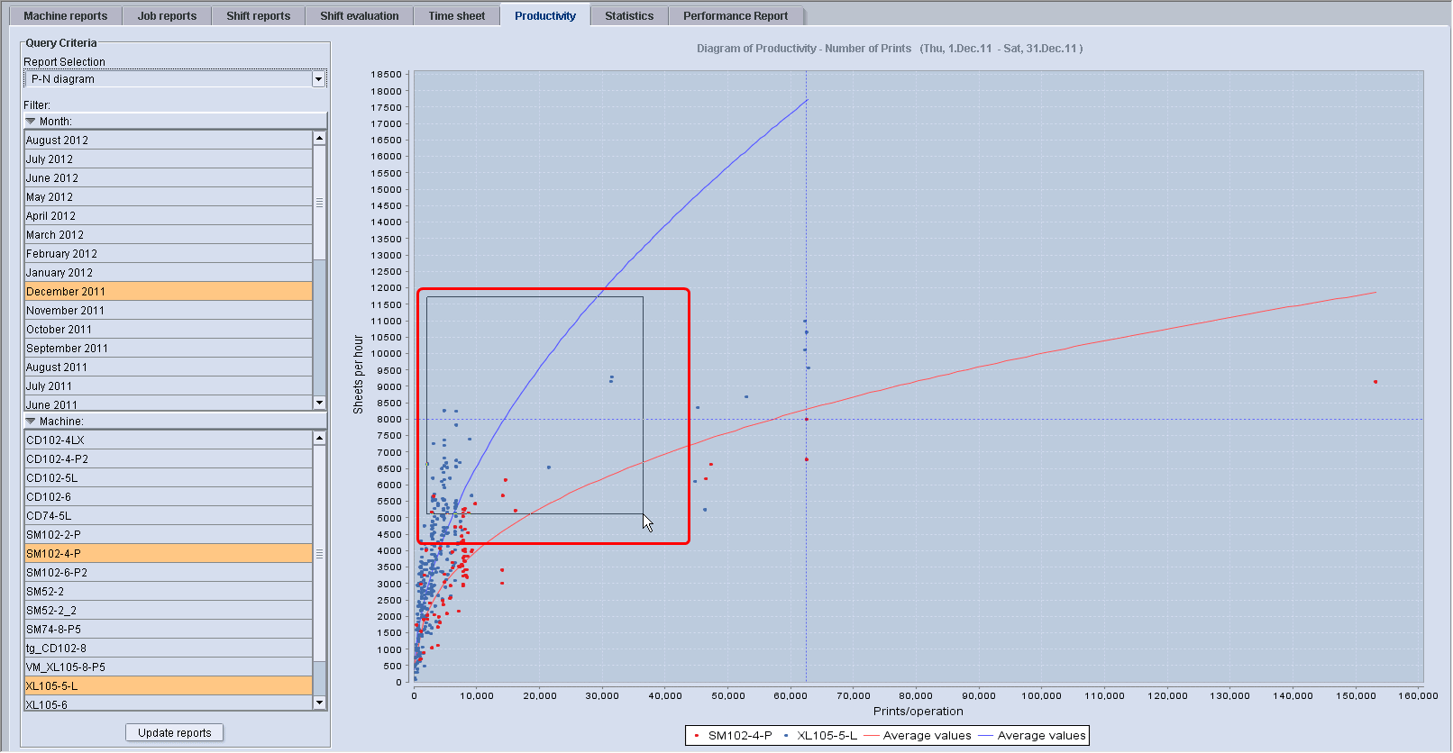
P-N diagram (speed related to quantity)
Note: The P-N diagram evaluates only job-related times.
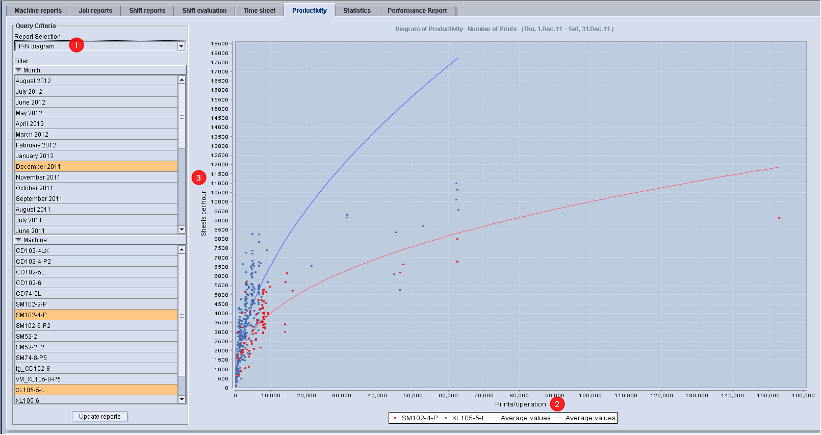
The P-N diagram (1) shows the dependency of the good impressions per hour (y axis; 2) on the good impressions per operation (x axis; 3) for each job from the selected period and for the selected machine(s).
It lets you differentiate between high-productivity jobs and low-productivity jobs and makes it easy for you to identify jobs with a high and low quantity.
Explanation of the P-N diagram
•Impressions per hour = good impressions/hour = productivity = P
•Impressions per operation = good impressions/operation = N
•Each dot represents a produced operation with a link to the job report (click on the dot).
•Graphic evaluation (curves) of the relationship between the following values:
·Average printing speed in impressions per hour (number of good impressions/total operation time = star to end of the operation).
·Impressions per operation (number of good impressions for every operation).
•Comparison of several machines in one diagram (dots of different colors represent different presses).
•Highly productive operations are in the upper section of the average curve, operations with low productivity are below the average curve.

Note: One job with two operations (perfecting) on one press is represented by one dot.
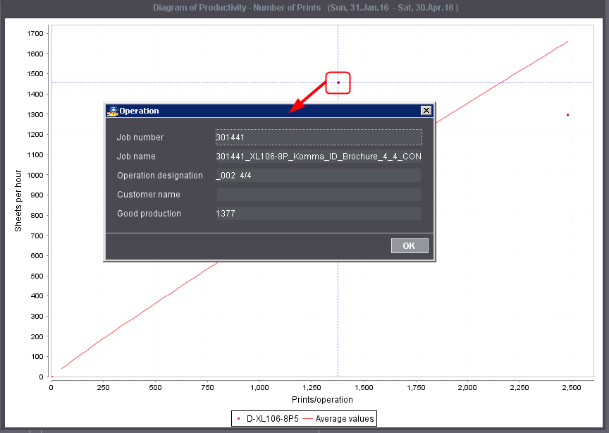
Every dot represents one produced operation. If you click a dot, the job belonging to this dot will display in the "Current job" dialog. You can then go directly to the job report.
1.Click in the chart with the mouse and hold down the left mouse button.
2.Now use the mouse to draw a box from the upper left to the bottom right.