
T-N diagram (production time related to quantity)
Note: The T-N diagram evaluates only job-related times.
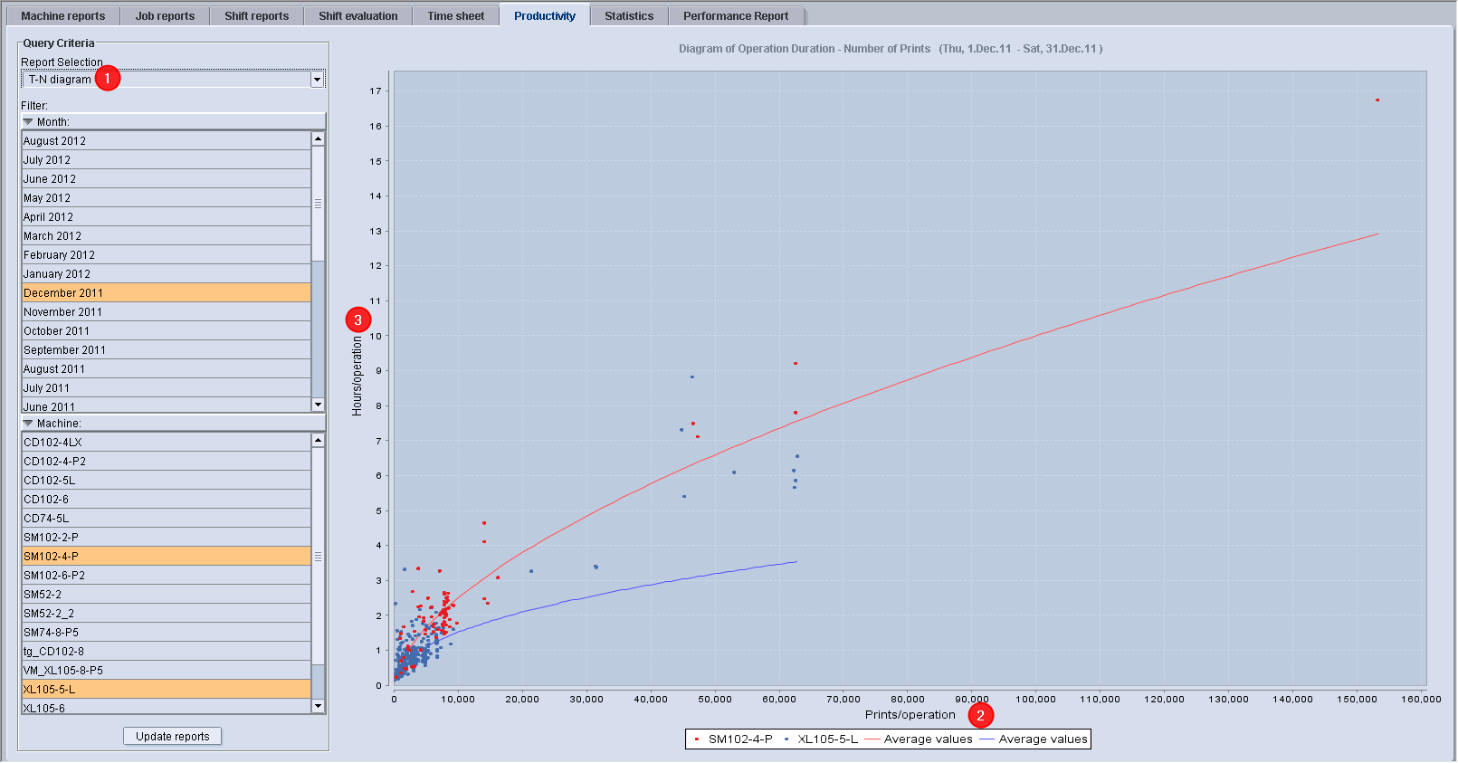
The T-N diagram (1) is to be used exactly like the P-N diagram. In this diagram, the duration of the operation (3) is evaluated in relation to the good sheets of the operation (2).
Explanation of the T-N diagram
•Hours per operation = total operation time/operation = duration = T
•Impressions per operation = good impressions/operation = N
•Each dot represents a produced operation with a link to the job report (click on the dot).
•Graphic evaluation (curves) of the relationship between:
·Operation duration in hours (total operation duration = start to end of the operation)
·Impressions per operation (number of good impressions for every operation).
•Comparison of several machines in one diagram (dots of different colors represent different presses).
•Highly productive operations are in the lower section of the average curve, operations with low productivity are above the average curve.

Note: One job with two operations (perfecting) on one press is represented by one dot.