 "Source Profiles" group
"Color settings" tab for Labelfire 340 presses
The options available in this tab are matched to the Labelfire 340 press. This means that options that do not suit this press model are not offered for selection. Other options are matched accordingly.
"Color spaces in PDF file"... "must still be customized" or "are already prepared"
Frequently, the input PDF files are prepared for an output process that is not designed for a seven-color inkjet digital press. Instead, they can be prepared for an offset print process or a flexographic output process. These documents can contain CMYK colors, spot colors, DeviceN (CMYK) or DeviceN (CMYK + spot colors). Such documents are referred to as "PDF files with prepared color spaces" in the Prinect digital printing workflow.
For the Primefire 106 and Labelfire 340 inkjet presses, the input documents must be matched to the color space of the inkjet press (C + M + Y + K + Orange + Green + Violet). Because the inkjet presses cannot print spot colors in the original (except for Orange, Green, Violet), it is necessary to convert spot colors to the color space of the digital presses, matching the original colors as accurately as possible to the press color space in this process. The colors are matched to the 7C target color space of the digital presses in a special process called "spectral color management".
This process is enabled or disabled with these options:
"must still be customized" option
Select this option if the PDF files were not yet matched to a special target color space. These documents are printed on the digital press using the setup output condition. Additional matching is not necessary.
The "Source Profiles" group can be seen and used with this option. The settings are equivalent to the settings for toner-based digital presses.
"Source Profiles" group
 CMY colors
"Enable CMYK Color Management" option
Use this option to specify that a CMYK input profile will be used for color conversion.

Note: Except for the selection of the input profile, the parameters for CMYK color management are also applicable for grayscales.
If this option is not selected, the documents are not processed with color management. This option is necessary, for example, if the digital prints are to be used for color calibration (e.g. with the Prinect Color Toolbox). In this case, the output documents may not be processed with color management. Neither a CMYK input profile nor an output profile will be used.

Note: Color management for documents with RGB and grayscale colors remains enabled even if "Enable CMYK Color Management" is disabled.
"Use Embedded Profiles" option
If documents containing colored objects or images are to be output, these objects are automatically converted so that they can be output in the CMYK or grayscale color space. The input profiles required for the input color space -> profile connection space transformation are usually included in the PDF documents and are used by color management. If the PDF documents do not have an input profile, you can use the standard input profile set by default or select a different one using the Browse button.
You use the "Use Embedded Profiles" option to define which CMYK input profile will be used:
•If this option is enabled and a device-dependent input profile is embedded in the edited PDF document, then this profile will be used as the input profile.
•If this option is enabled and no input profile is embedded in the PDF files, the CMYK ICC profile selected in "If no profile is known" will be used for color management.
•If this option is not enabled, the CMYK ICC profile selected in "If no profile is known" will always be used for color management.

Note: The selected profiles are checked for suitability for the current context. A warning is issued if an unsuitable profile is selected.
You can create input ICC profiles – unless appropriate device profiles are already available – for example with the "Prinect Color Toolbox" and place them on the Prinect Server. The ICC profiles are saved in their subfolders in a folder below the path "PTConfig\SysConfig\Resources\ICC Profiles" (PTConfig is the shared configuration folder of the Prinect Server). This is where you can add custom ICC profiles and create appropriate folders if required.

Note: In "Administration" > "Resources" > "ICC Profiles" you can see an overview of all ICC profiles available in the Prinect workflow (see also ICC Profiles). You can also import new profiles, create a new profile folder, delete profiles, etc.
Separate input profile settings for image and text elements or graphic elements
By default, the "Input Profiles", "Rendering Intent" and "BPC" (black point compensation) parameters are available for CMYK and RGB colors for image, text and graphic objects. This means that the set parameters (input profile, rendering intent, black point compensation) are valid for image, text and graphic objects.
Click the plus sign beside the "Images" icon to display the same parameters for image elements and for text/graphic objects separately. In this way, you can set up the input performance of color management separately for image/text objects and for graphic objects.
The settings that currently can be seen always affect color management.
•Collapsed (plus sign displays): joint settings for image, text and graphic objects.
•Expanded (minus sign displays): separate settings for image objects and text/graphic objects.
In addition to selecting ICC profiles, you can set the rendering intent for the colored objects. Rendering intent determines how color matching is done. Since losses always occur during a color space transformation, it can be helpful, for example, to retain the photographic perception of an original and to accept a limit on the number of color values. The following parameters are available for rendering intent: "Perceptual", "Saturation", "Relative Colorimetric" and "Absolute Colorimetric":
•Perceptual
When you use the "Perceptual" parameter, you obtain an output, that essentially contains the perceptible impression of the original. This means that the precise, colorimetric rendering of the colors is modified in favor of the retention of the relative color relationships. In a smaller target color space, the color gamut is compressed accordingly. Vice versa, in a larger target color space and with suitable profiles, the color space may be expanded. With this color matching option, the hue in all the natural colors of the original is reproduced for the most part correctly but with restrictions in the contrast. The type of color matching is manufacturer-specific, with the user being able to set some of the aspects such as contrast and chroma change during profile generation. This option is especially suitable for photographs.
•Saturation
In the output, the colors are rendered in such a manner that the color saturation is retained or even emphasized. The type of color matching is manufacturer-specific, with the user being able to define some settings during profile generation. This option is suitable for business graphics where the color saturation is the most important attribute in color rendering.
•Relative colorimetric
Colors are rendered taking solely the light source into account. The rendering intent of the print medium (e.g. the color of the unprinted paper) is not taken into account. For example, the illuminant of a monitor would be correctly rendered on the print medium. That is why the term "relative" is used. All colors that lie within the output color space are rendered identically. All colors that lie outside of the output color space are displayed on the margin of the output color space. That is why the term "colorimetric" is used.
The advantage of this rendering intent is that different illuminants of different output media are taken into account. The disadvantage is that the color adaptations are not exactly retained when switching from one output medium to another. As a result, very dark or very colorful details in the originals can be lost when they are reproduced. The substrate is not simulated during an output process simulation. If production run paper is used during the simulation, the result is the same as if you used the "absolute colorimetric" rendering intent. This rendering intent is suitable mainly for vector graphics.
•Absolute colorimetric
Colors are rendered taking the light source and the medium illuminant (e.g. the color of the unprinted paper). For example, the illuminant of a newsprint paper which is shifted from illustration printing paper towards yellow compared to the illuminant of paper is rendered with a yellowish cast. That is why the term "absolute" is used. That is why "Absolute colorimetric" is the default setting for a proof output. All colors that lie outside of the output color space are displayed on the margin of the output color space.
The advantage of this rendering intent is that the exact color values are retained when switching from one output medium to another. The disadvantage is that any colors that lie outside of the output color space cannot be distinguished. This rendering intent is especially suitable for logos or monochrome objects which must be reproduced exactly the same way on different output media.

Note: "Absolute colorimetric" is always set as the rendering intent for spot colors. This makes sure that the spot colors are simulated as best as possible.
•From Document
The Color Rendering Intents that were defined for images and graphics in the PDF documents are used. Normally, "relative" is set as the rendering intent in the PDF documents. However, different rendering intents may have been assigned to single objects. In such cases, the object-related rendering intent is used if this option is set. If necessary, you can check such PDF documents in advance, for example, with the Prinect PDF Toolbox.

Note: You should select "From Document" only if you are sure that the edited documents have rendering intent settings that can correctly control the color space conversion desired. However, if this is not sure, you should not use this setting if possible.
"BPC" (black point compensation) option
Black point compensation (BPC) becomes active if you enable the "BPC" option. You can enable black point compensation (BPC) for "Relative Colorimetric" "Perceptual" and "Saturation" rendering intents. However, the effect of this option can only be seen for the rendering intent "Relative Colorimetric".
In gamut mapping, all L shadows (in the L*a*b* color space) that are darker than black toner/ink are matched to black toner/ink and, as a result, shadow definition is lost.
Black point compensation enhances the reproduction area when the "Relative colorimetric" rendering intent is used for color space conversion to the L*a*b* color space or from the L*a*b* color space to the device color space. The L*a*b* color space has more lightness levels for dark image parts than the CMYK color space because the L*a*b* color space is larger than the CMYK device color space. In a color space conversion from the L*a*b* to the CMYK color space with "Relative Colorimetric" rendering intent, the color space is cut off or reproduced without definition in the shadows because they are located outside the displayable range. As a result, details in dark parts of the image are often lost, especially if ICC profiles for uncoated papers are used for color space conversion.
Black point compensation matches the black point during color space conversion, causing the definition in such dark image parts to be kept. This "elongates" the shadows causing color shifts to occur also in the lighter color values. For that reason, this method is not always suited to true-color proofing.
We recommend that you use "Perceptual" rendering intent with black point compensation and not "Relative Colorimetric" rendering intent. This rendering intent makes it possible for the various details in dark image parts to be reproduced, while keeping color shifts to a minimum. In principle, differences cannot be fully avoided because of the different sizes of the color spaces.
"Keep CMYK Colors" parameter
When this option is enabled, CMY in solid tint single-color or two-color image parts is kept.
Normally, if color management is used, C=100, M=0, Y=0, K=0 becomes, for example, C=96, M=12, Y=8, K=2. In other words, "dirtying elements" creep in. These elements are fully correct if you have a true-color display. However, this behavior may not be wanted in technical diagrams because color margins occur at the mainly clearly defined edges, for example, due to register errors or if the maximum color of the original printing process is to be retained for this color area.
"Primaries (solid)" selected
Cyan, magenta, yellow and black (K) are the primary colors in the CMYK color model. When this is selected, only the solid tint primaries with a value of 100% are kept in their original color percentages, meaning that they are not changed by color management. Example: 100% magenta.
"Primaries (all)" selected
When this is selected, all the primaries (including those less than 100%) are kept in their original color percentages, meaning that they are not changed by color management. Example: 70% magenta.
"+ Secondaries (solid)" selected
Secondary colors are colors that result from mixing two primary colors (C, M,Y). Secondary colors are "red" (C=0, M=100, Y=100), "green" (C=100, M=0, Y=100) and "blue" (C=100, M=100, Y=0) in the CMYK color model.
The preservation of secondary colors is always in addition to the preservation of primary colors. This is highlighted by the prefixed plus sign.
When secondary colors (solid tint) are preserved, solid tint secondaries each with 100% are kept in addition to the primaries, e.g. blue (C=100, M=100, Y=0, K=0).
By clicking the plus sign in front of the list box, you can set up that CMYK colors will be kept separately for images and graphics.
"+ Secondaries (all)" selected
When secondary colors (all) are preserved, all the secondaries are kept in addition to the primaries, even if originally they are not made up of 100% primaries. For example, red (C=0, M=80, Y=80, K=0) doesn't change.

Caution: You should enable the preservation of primary / secondary colors only if, for technical reasons, the colors really have to be kept and not be influenced by color management. You should never enable these options by default as otherwise you can have results that you may not want in your printing.

Note: Objects or documents in the "Gray" color space are not handled by color management if "Preserve colors" is enabled.
 RGB colors
"Use Embedded Profiles" option
See "Use Embedded Profiles" option.
Separate input profile settings for image and text elements or graphic elements
See Separate input profile settings for image and text elements or graphic elements.
"BPC" (black point compensation) option
See "BPC" (black point compensation) option.
 Keep Black
The Keep Black setting must be set up only for text and graphic objects because of the special color management process that is used with Primefire inkjet presses. The settings are equivalent to the settings for toner-based digital presses:
"Keep Black for Text / Graphics" option
If this option is enabled, color management does not affect black in the text or graphic objects. The following options are available for this:
•All
Black defined for output is kept in its original form for all text and/or graphic objects that only contain black. In other words, color management does not affect black definition.

Note: If "Keep Black for Text / Graphics > All" is enabled and a page has no other separations except for black, this is highlighted in the preview by a black separation icon.

This lets you see right away whether a sheet with apparently black content really only contains the black separation. Otherwise it might be printed unintentionally in several colors.
•Keep 100% Black
When enabled, this option has the following impact: If black is defined as C=M=Y=0 and K=100% or as R=G=B=0 and/or gray=0 in text or graphic objects, black is kept as 100% black or the colors are set to C=M=Y=0 and K=100%.
"Black Overprint" option for text / graphics
The "Overprint" function is mostly used to avoid register problems and flashes in black fonts and other black graphic objects that lie on top of a colored background. For design purposes, overprint is also used with hard shadows or colored CMYK objects. You can control overprint best if it is set directly in the application that creates the job.
The overprint settings of the Prinect Color Management on the one hand compensates for application shortcomings and on the other processes faulty documents so that you get the overprint effect you want. It's not possible to detect on a page which object is to overprint and which not. For that reason, these settings are not sufficient in some individual cases.
All black elements defined as knockout are set to "overprint" if this option is enabled.
This option affects the following color spaces: "DeviceCMYK" with C=M=Y=0%, "DeviceGray" or "/Separation/Black". You can use this option specifically on text and/or graphic objects.
The settings possible in "Spot Colors" do not depend on what you selected for "Color spaces in PDF file...": "must be customized" or "are already prepared".
"Remove 'DieLine'" option
"DieLine" spot colors will not be printed when this option is enabled..
"Output Quality ΔE00"option
This function gives you the option of checking the accuracy with which spot colors can be simulated in digital printing without having to output test prints.
The ΔE 2000 values display for each spot color for the set substrate. The ΔE 2000 value displayed is red if it exceeds a critical amount.
"Spot Color Matching" function
In principle, the process for spot color matching is similar to that for Versafire presses (see "Spot Color Matching" function) but the ink recipes used for replacing spot colors are not determined from CMYK colors but use a process based on the spectral composition (wavelengths of light) of the spot colors. As a result, there are some differences in the "Spot Color Matching" dialog.

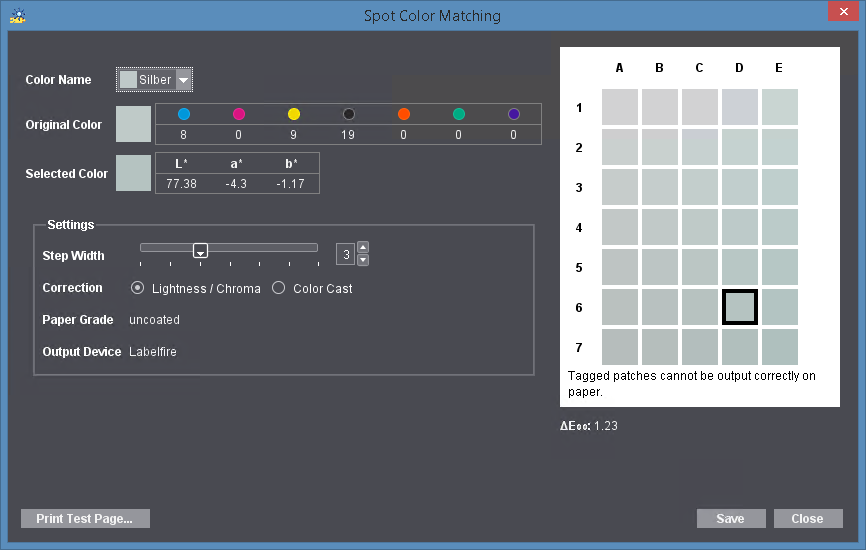
1.In the "Color Name" list box, first select the spot color for which you want to define a substitute color. All the spot colors that are in the current print job are listed.
The original color displays in the middle color patch "C4" in the preview window. Modified colors display around the original color.
The aim of these settings is to determine a color that optimally replaces the original spot color, allowing it to be output correctly (in other words, a color that is not marked by an "x").
2.Click "Print Test Page".
·A test chart is printed immediately if the job does not have any spot colors.
·The "Print Test Page" dialog displays if the job has one or more spot colors:

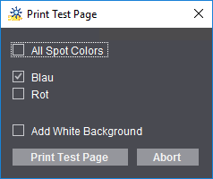
This is where you can set that test charts will be printed for all spot colors at the same time or for one or more spot colors.
The test page can be given a white background to enhance the color impression when assessing a spot color, for example, when printing to foil.

Prerequisite: The "Add White Background" option is available only for presses that have an inking unit for "White" (e.g. Versafire CV, Labelfire 340).
Enable "Add White Background" to use this function.

Note: For Labelfire digital presses, the width and the height of the test chart is set to match the width and segment length of the current print job. In other words, a uniform width and segment length is also used for printing a test chart for a job. This facilitates in particular the output of test charts if a combination of digital printing and conventional printing units (flexographic printing, punches, coating unit, etc.) is used in the print job.
3.Now compare the printout of the test chart with the original copy and determine the color patch that best matches the original spot color.
4.If the deviation is still too big, enable either "Lightness/Chroma" or "Color Cast" in "Correction" to set the type of color change. Now move the "Step width" slider until suitable patches display in the preview window. The bigger the step width, the greater the differences between each of the color patches.
5.Now repeat steps 2, 3 and 4 until you are satisfied that the target color is determined accurately enough. On the test chart, the patch with the correct color has an "address", e.g. "D6".
6.Click the "D6" patch in the "Spot Color Matching" dialog.
The CMYK values or the L*a*b* values (whichever one is defined) of the original color display in "Original Color". The L*a*b* values of the selected color display accordingly in "Selected Color" (in our example, those of "D 6").

Note: The values of the target color are always specified as L*a*b* values for Primefire or Labelfire digital presses.
The values for spot color replacement are entered into the color data of the current print job and can be modified there if required. They only affect the current job.
The ΔE 2000 value of the currently selected color patch displays below the color patches. When you move over a different color patch with the mouse cursor, the current ΔE 2000 value of this patch displays. This is a fast way to view the differences to the original color and find an optimal substitute color.
7.If you are satisfied with the colors selected, confirm the dialog with "Save".
The "Paper Grade" and "Output Device" boxes are for your information only.
Select this option if the PDF files are already prepared for an output process (as described above) that deviates from the designated output process with a Heidelberg inkjet digital press. Spectral color management for matching the colors to the color space of the digital press is enabled with this option. InRIP Color Management is disabled.

Note: Comparison of the N-Color color profiles with the colors available on the press: If a print job with an N-Color profile is output, the process colors in the profile must also be available on the press. For that reason, the colors of the profile are compared with the colors available on the press. The profile is rejected with an error message if the colors required are not available.
 CMY colors
You must select "CMYK Work Color Space" in this setting. This setting affects only CMYK colors in the edited PDF files. "CMYK Work Color Space" is an ICC profile that is defined in design applications (InDesign, Photoshop, ArtPro, etc.) or in InRIP Color Management as a "press profile" or a "target profile", e.g. "Coated FOGRA39".
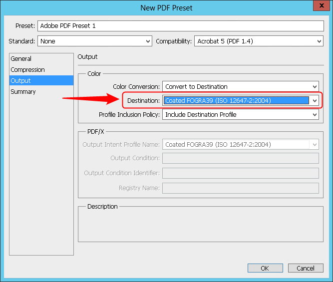
Example: CMYK work color space in Adobe Photoshop

Note: The selected profiles are checked for suitability for the current context. A warning is issued if an unsuitable profile is selected.
After the RIP process, the profile that you select in "CMYK Work Color Space" is applied to the CMYK colors of the edited PDF files and not to any existing spot colors. It should be the same profile that was set as the target profile in the creator application or as the press profile in a Prepare sequence that may have been run beforehand. See "Press Profile" box.

Note: You can determine the target profile used away from the Prinect workflow by opening the PDF file concerned in Acrobat and creating a preflight report with the Prinect PDF Toolbox. The preflight report contains details about the target profile used ("Color space").

Prerequisite: This function for Primefire and Labelfire digital presses can be used only by Cockpit users who have the "Color Manipulation" permission. See "Permissions" Tab.
This function lets you customize the CMY values of the job. This function is designed for the case that jobs that were already printed in offset printing without compliance to the ISO standard must be matched to digital printing.
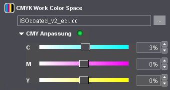
Using the sliders or the numeric boxes, you can modify the CMY values of the input PDF documents (in percent). These modifications have no impact on spot colors. A green dot indicates that the values were matched.
 Keep Black
"Keep Black" option
InRIP Color Management has no influence on the output of black for prepared PDF files.
•Black objects or pure K percentages in CMYK objects:
Black will be output as a mixture of orange, green and violet (calculated by spectral color management) and C = M = Y = K = 0.
•Black objects and spot color percentages or K separations and spot color percentages:
Black will be output as a mixture of orange, green and violet (calculated by spectral color management) and percentages of CMYK.
"All" option
Keep Black impacts all objects that have black parts.
"Keep 100% Black" option
Keep Black impacts only objects where area coverage in the black separation is 100%.
 Spot colors
The settings possible in "Spot Colors" do not depend on what you selected for "Color spaces in PDF file...": "must be customized" or "are already prepared". See Spot colors.
