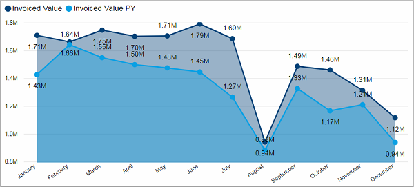
•Invoiced Value and Invoiced Value PY by Month Name
•Top Customers by Invoiced Value % of Total
•Top Representatives by Invoiced Value
•Top Product Group by Invoiced Value
Invoiced Value and Invoiced Value PY by Month Name
This chart shows you the invoiced value for each month. If you have selected more than one year, it shows you the combined values making it easy to find trends for certain months. If you have selected only one year, than you can compare this year with its predecessor.
Facts & Dimensions:
·Y-axis Dark blue [currency]: Invoiced Value
·Y-axis Light blue [currency]: Invoiced Value PY
·X-axis [date]: Month Name
Top Customers by Invoiced Value % of Total
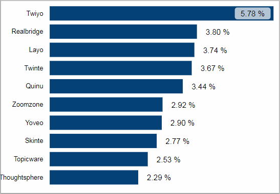
This visual shows you the top customers by their share of your total invoiced value. In this case the customer "Twiyo" accounted for almost 6% of the total invoiced value.
Facts & Dimensions:
·Y-axis: Customer
·X-axis [%]: Invoiced Value % of total
Drillthrough:
Top Representatives by Invoiced Value
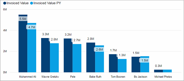
This tile shows you the top representatives by the active years’ invoiced value compared with the values of the previous year.
Facts & Dimensions:
·Y-axis Dark blue [currency]: Invoiced Value
·Y-axis Light blue [currency]: Invoiced Value PY
·X-axis: Current Representative
·Drill Down => X-axis: Customer
Drillthrough:
Top Product Group by Invoiced Value
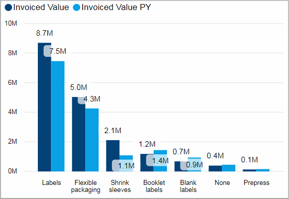
This visual shows you the top product groups by invoiced value (compared with the values of the previous year).
Facts & Dimensions:
·Y-axis Dark blue [currency]: Invoiced Value
·Y-axis Light blue [currency]: Invoiced Value PY
·X-axis: Product Group
Drillthrough: