•Shipped On Time Confirmed %, Diff Shipped Ordered SQM % and Shipped Value by Customer
•Shipped On Time Confirmed % by Year Month
•Diff Shipped Ordered SQM % per Year Month
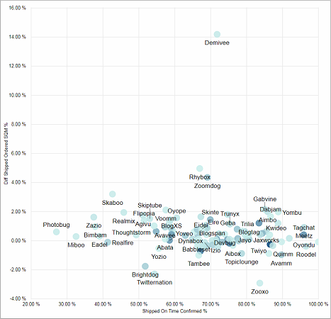
Shipped On Time Confirmed %, Diff Shipped Ordered SQM % and Shipped Value by Customer
This visual measures the shipment performance per customer. Each dot represents a customer. The darker the color, the higher the Shipped Value of the customer.
The X-axis answers the question: "Did we ship in time?" For instance, the customer "Demivee" received around 70% of his orders on time.
The Y-axis answers the question: "Did we ship more or less than what was ordered?" For instance, the customer "Demivee" received 14% more square meters of produce than the customer has ordered.
Facts & Dimensions:
·Y-axis [%]: Diff Shipped Ordered SQM %
·X-axis [%]: Shipped On Time Confirmed %
·Dots: Customer
·Color of the dots (the darker the higher): Shipped Value
Drillthrough:
Shipped On Time Confirmed % by Year Month
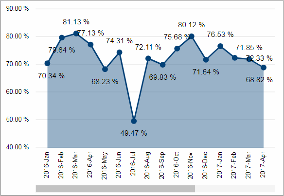
Facts & Dimensions:
·Y-axis [%]: Shipped On Time Confirmed %
·X-axis [date]: Year Month
Diff Shipped Ordered SQM % per Year Month
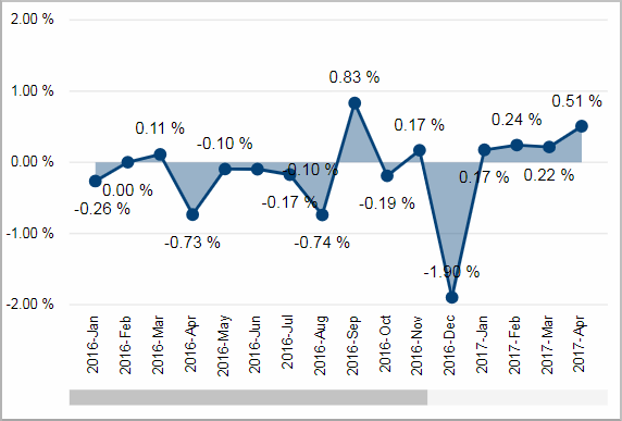
Difference between Shipped SQM and Ordered SQM. For instance, in September 2016 we shipped 0.83% more square meters of produce than was ordered.
Facts & Dimensions:
·Y-axis [%]: Diff Shipped Ordered SQM %
·X-axis [date]: Year Month