•Net productivity per hour by date and device
•Net productivity per hour and net output per hour
•Net output by date and device
•Net output by date and device
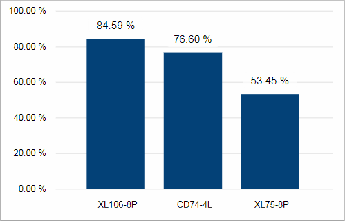
The speed of the device is defined as gross volume produced per production time. The Speed Index is the actual speed divided through the maximum possible speed of this device.
This chart shows the average Speed Index of the last 10 days for your devices.
Facts & Dimensions:
•Y-axis Dark blue [X]: Speed Index (%)
•X-axis: Device
Drillthrough:
Net productivity per hour by date and device
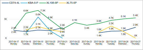
The net productivity is defined as the net volume divided through the whole operating time (from switch on to switch off). It tells you how many good products were produced per operating hour.
This line chart shows you the productivity for each of the last 10 days for every device.
Facts & Dimensions:
•Y-axis [units/h]: Net Productivity (1/h)
•Colors by: Device
•X-axis [date]: Date and Day Name
Drillthrough:
Net productivity per hour and net output per hour
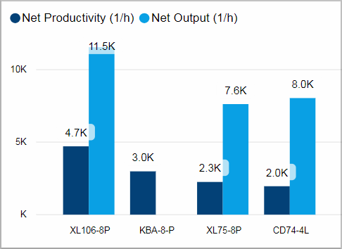
Net Output is defined as the net volume divided through the operation related time - in contrast to the net productivity which takes the complete operation time from switch on to switch off into account.
This chart shows the average net productivity and the average net output of the last 10 days for every device.
Obviously the value for net output will always be bigger than for the net productivity. The bigger the difference between these two values the more time has passed that was not used for production.
Facts & Dimensions:
•Y-axis Dark blue [units/h]: Net Productivity (1/h)
•Y-axis Light blue [units/h]: Net Output (1/h)
•X-axis: Device
Drillthrough:
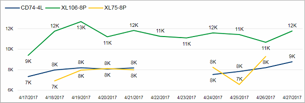
This line chart shows you the average net output for each of the last 10 days for every device.
Facts & Dimensions:
•Y-axis [units/h]: Net Output (1/h)
•Colors by: Device
•X-axis [date]: Date
Drillthrough: