•Quality Index by month and its rolling average
•Quality Index by month and year
•Speed Index by month and its rolling average
•Speed Index by month and year
•Time Index by month and its rolling average
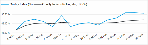
Quality Index by month and its rolling average
#
This line chart shows you the Quality Index for each month and its rolling average over the last 12 months. This way you can see if the index performed better or worse than the average in a certain month.
Facts & Dimensions:
•Y-axis Light blue line [%]: Quality Index (%)
•Y-axis Black line [%]: Quality Index - Rolling Avg 12 (%)
•X-axis [date]: Year Month
Quality Index by month and year
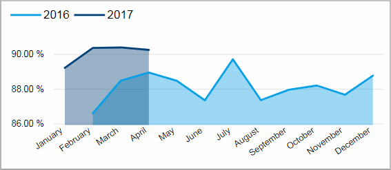
This chart shows you the Quality Index per month. The years are represented with differently colored lines. This way you can find seasonal trends.
With this chart you can compare the quality in
Facts & Dimensions:
•Y-axis [%]: Quality Index (%)
•Colors by: Year
•X-axis [date]: Month Name
Speed Index by month and its rolling average
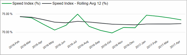
This line chart shows you the Speed Index for each month and its rolling average over the last 12 months. This way you can see if the index performed better or worse than the average in a certain month.
Facts & Dimensions:
•Y-axis Green line [%]: Speed Index (%)
•Y-axis Black line [%]: Speed Index - Rolling Avg 12 (%)
•X-axis [date]: Year Month
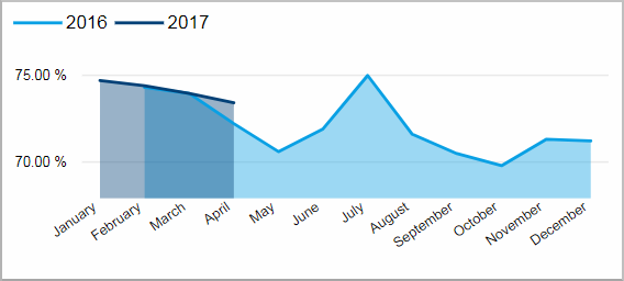
This chart shows you the Speed Index per month. The years are represented with differently colored lines. This way you can find seasonal trends
Facts & Dimensions:
•Y-axis [%]: Speed Index (%)
•Colors by: Year
•X-axis [date]: Month Name
Time Index by month and its rolling average
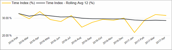
This line chart shows you the Time Index for each month and its rolling average over the last 12 months. This way you can see if the index performed better or worse than the average in a certain month.
Facts & Dimensions:
•Y-axis Yellow line [%]: Time Index (%)
•Y-axis Black line [%]: Time Index - Rolling Avg 12 (%)
•X-axis [date]: Year Month
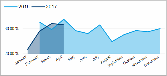
This chart shows you the Time Index per month. The years are represented with differently colored lines. This way you can find seasonal trends.
Facts & Dimensions:
•Y-axis [%]: Time Index (%)
•Colors by: Year
•X-axis [date]: Month Name