•Effective processing time and production time
•Net volume per operation and waste percentage
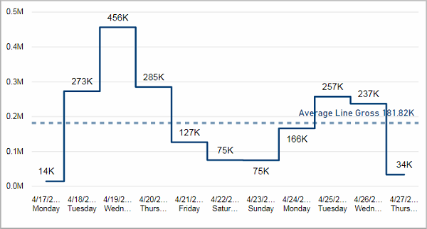
This visual shows the gross volume for each day. The average gross volume over the last 10 days is depicted with a dashed horizontal line. This way you can see which days were above or below average.
Facts & Dimensions:
•Y-axis [units]: Gross Volume
•X-axis [date]: Date and Day Name
Effective processing time and production time
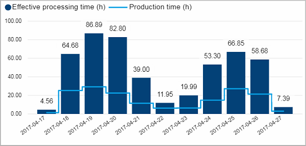
This visual shows you how occupied your machines were on each day.
It displays the effective processing time and the production time in hours over all selected devices. The effective processing time measures the total time a device is occupied by an operation whereas the production time only measures the time that was actually used for the production excluding all times when the device stopped.
This visual offers additional tooltip visualizations. When you hover with the mouse over a column a visual appears that shows the results of this day for the individual devices.
Facts & Dimensions:
•Y-axis Dark blue [h]: Effective Processing Time (h)
•Y-axis Light blue line [h]: Production Time (h)
•X-axis [date]: Date
Drillthrough:
Net volume per operation and waste percentage
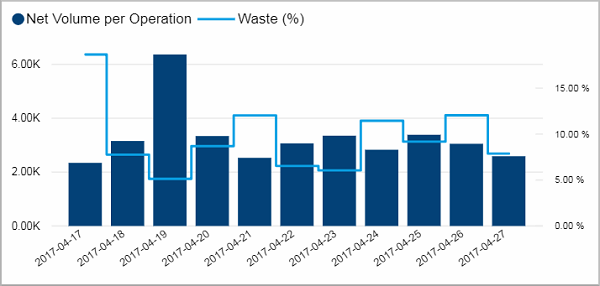
This visual shows you the productivity for each day. It displays the net volume per operation and the waste percentage for each day.
This visual offers additional tooltip visualizations. When you hover with the mouse over a column a visual appears that shows the results of this day for the individual devices.
Facts & Dimensions:
•Y-axis Dark blue [units]: Net Volume per Operation
•Y-axis (2nd) Light blue line [%]: Waste (%)
•X-axis [date]: Date
Drillthrough: