•Net volume per operation and operation count
•Net volume per operation by date and device
•Waste volume per operation and waste percentage by device
•Waste volume per operation by date and device
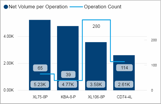
Net volume per operation and operation count
This visual shows you the net volume per operation and the operation count during the last 10 days for each device.
Facts & Dimensions:
•Y-axis Dark blue [units]: Net Volume per Operation
•Y-axis (2nd)Light blue line: Operation Count
•X-axis: Device
Drillthrough:
Net volume per operation by date and device
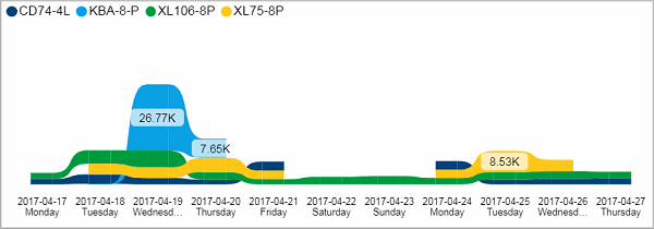
This ribbon chart shows you the net volume per operation for each device per day.
Facts & Dimensions:
•Y-axis [units]: Net Volume per Operation
•Colors by: Device
•X-axis [date]: Date and Day Name
Drillthrough:
Waste volume per operation and waste percentage by device
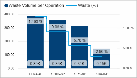
In this visual you can see the waste volume per operation and the waste percentage cumulated over the last 10 days for each device.
Facts & Dimensions:
•Y-axis Dark blue [units]: Waste Volume per Operation
•Y-axis (2nd) Light blue line [%]: Waste (%)
•X-axis: Device
Drillthrough:
Waste volume per operation by date and device
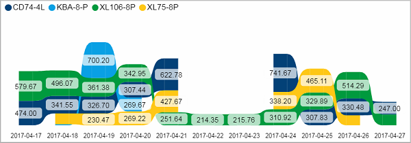
This ribbon chart shows you the waste volume per operation for each device per day.
Facts & Dimensions:
•Y-axis [units]: Waste Volume per Operation
•Colors by: Device
•X-axis [date]: Date
Drillthrough: