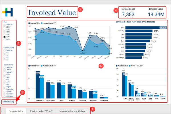
How is a report page build up in Prinect Smart BI?
All the preconfigured reports are built up in a similar manner. On the bottom [1] is a register bar with all the pages of this report. You can switch between the pages by clicking on the respective register. If a report has more pages than there is room at the bottom of the page, you can use the arrow keys to switch the view.
On top of each page is the title [2]. In most cases the title is identical to the name in the register bar, but sometimes the latter had to be shortened.
In the area on the left side [3] are check boxes that you can use to filter your results. Maybe you want to restrict the results to the first quarter of the year or maybe you just want to see how well a certain machine performed. Which filters are offered differs from report page to report page.
The information on a page can be presented in fields that simply write out the value [4] and in tiles that contain visual representations of the data [5].
If you want to find out more about the report page, you can click on the link "Smart BI help" [6] in the lower left corner. It will open this help directly on the page, where this report page and its tiles are described.
The preconfigured reports use the following sort of tiles:
•Bar and column charts (stacked and clustered)
•Maps
This is a basic type of chart that is mostly used to show trends over intervals of time.
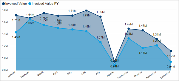
While the X-axis shows an interval of time the Y-axis displays the assigned values. There can be two Y-axis with different scales. For example, the left Y-axis shows the scale for real margin in € and the right Y-axis shows the percentage value of the real margin.
The data values are plotted with dots and connected with lines.
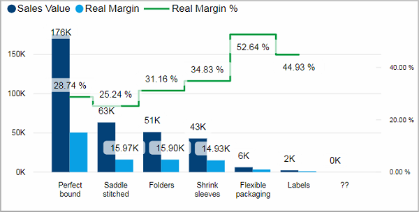
Bar and column charts (stacked and clustered)
Data values can be represented with horizontal (bars) or vertical (column) rectangular shapes whose length or height is proportional to their value. Some bar graphs present bars clustered in groups, showing more than one measured value. Alternatively, one can stack bars that belong to a group on top of each other. The height of the resulting bar shows the combined result for the group.
This chart type is well suited for comparing different values with each other.
In a scatter chart the data is displayed as a collection of dots, each having the value of one variable determining the position on the X-axis and the value of a second variable determining the position on the vertical axis.
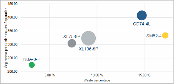
A third variable can be visualized by the color of the dots. The higher the value of the variable the darker the color of the dot could be. The same goes for the size of the dots. A total of four variables can be represented in such a scatter chart.
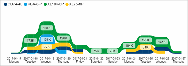
In a ribbon chart the highest value for each time period is always displayed on top (the next lower beneath and so forth). It is effective to show changes in the ranking of your data.
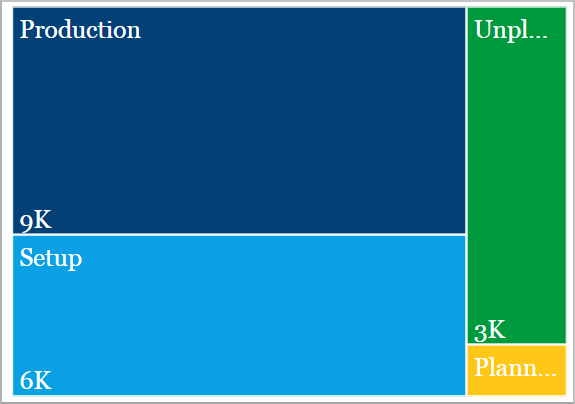
A treemap chart displays hierarchal data with nested rectangles in different colors. The value of the datapoint is proportional to its size. The rectangles are arranged from top left (largest) to bottom right (smallest).
In the example above the whole rectangle represents the working time of a machine. It is divided into production time (the biggest chunk), setup time, as well as unplanned and planned downtime.
You could add lower hierarchy data by nesting further rectangles into these shapes. For example, the production time could be further subdivided into the time used for individual production steps.
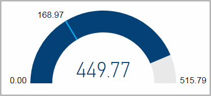
A gauge chart measures the progress towards a target value on a semicircular arc. That goal is indicated by a thin line. It can also be used to show percentile measures.
The shaded arc and the number in the center of the semicircle display the current progress on a scale from a set minimal value to a set maximum value.
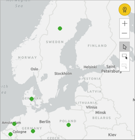
Maps are used to join quantitative values with spatial locations.
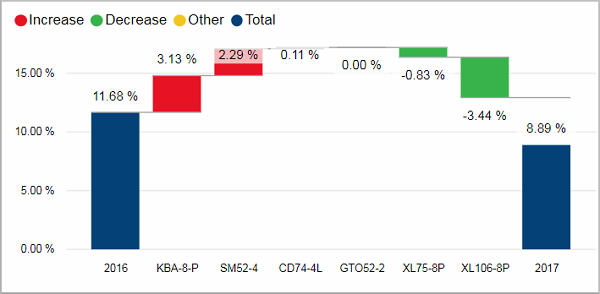
A waterfall chart is used to visualize how a starting value is decreased or increased by different factors.
The left column represents the starting value. The right column gives the end value. The floating columns in between show the transformation of the starting to value to the end value. The different colors indicate if the change is positive or negative.