Utilization by devices: Key factors by devices - Time utilization
(Change language of this page to: English, Deutsch)
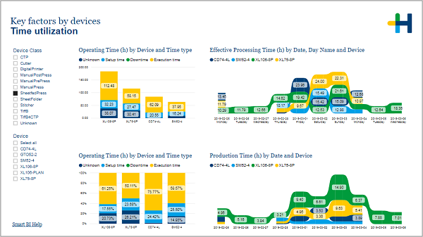
On this page you can see how much time your devices spend on production compared to the time they were setup or stood still.
On the left hand side you can select the devices that are shown in the visuals.
This page offers you four visuals to control the time utilization of your devices.
The two column charts show you how much time each device spend in the different time phases during the last 10 days. The visual above gives you absolute values in hours while the one below shows the value in percentage of the operating time.
The ribbon charts show the effective processing time and the production time for each device for each of the last 10 days. The chart above shows the time that was spend from the start to the end of an operation, while the visual below only factors in the time that was actually used to produce goods (including waste).
Both effective processing time and production time should desirably be running evenly each day and the most effective resources should work at the maximum available time.
Furthermore there shouldn’t be large differences from day to day.
HD Privacy Statement | Imprint | Prinect Know How