How can you interact with the visualizations?
The data visualizations in Prinect Smart BI are not just static graphs. You can interact with them and change the view dynamically as you work. There are several methods to get exactly the information out of a graph that you are looking for:
•by Left click on data points
Filter for the selected value.
•by Right click on data points
Move in the hierarchy levels, in- and exclude data, show data and drillthrough functionality.
•by Filter
•by Edit menu
Move in the hierarchy levels, pin to dashboard, change the sorting, show and export data
Simply clicking on data points is an easy way to filter for exactly the information you are interested in.
When you click on a data point in one tile the remaining dots, lines or columns (depending on the chart type) in this tile turn pale while the rest of the page is recalculated. All the other graphs now only show the data that belongs to the selected data point.
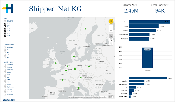
Here is an example:
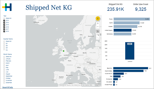
On this page you can see the shipped weight for different delivery destinations and representatives. When you click the bar next to "United Kingdom" the graphs recalculate so that only the weight that was shipped to this country will be shown:
When you right click on a data point a context menu appears that offers you several commands:
•Show Next Level / Expand to next level
Not every command is available for every data point. Some like Drill Down and Drillthrough are limited to specific tiles.
When data for a visual follows a hierarchy, you can use the Drill Down functionality to reveal additional details. Maybe your visual shows the real margin per customer group. Drilling down would then show you the real margin per customer city. Drilling down again would finally reveal the real margin per customer. To return to a higher hierarchy right click and select "Drill Up". Alternatively you can use the arrow buttons in the edit menu of the tile. See Edit menu.
You can see if the visualization has a hierarchy and offers the possibility to drill down by hovering over it. If drill controls [1] appear in the upper corners you can drill down.
Here is an other example:
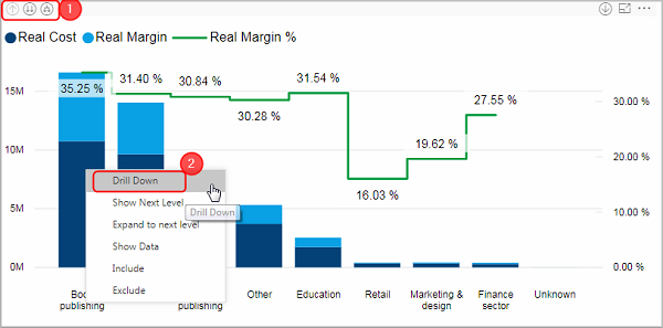
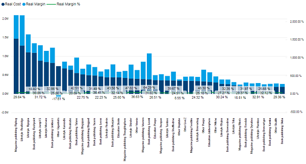
This stacked column chart shows the real cost and the real margin per customer group. If you want to see detailed results for every customer that belongs to the group "Book publishing", right click on the respective column and select "Drill Down" [2].
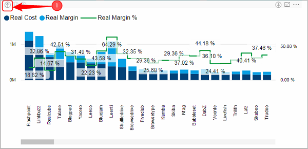
The chart now shows the real cost and real margin for each customer. To go back to the customer groups select "Drill Up" from the context menu or click on the arrow button [1] in the edit menu.
Show Next Level / Expand to next level
The commands "Show Next level" and "Expand to next level" are only available when the visualization has a hierarchy. See Drill Down / Drill Up.
When you use "Drill Down" the visual changes to show the values for the subgroups of only one group. With "Show Next Level" and "Expand to next level" on the other hand you can add an additional hierarchy level to the current view. You can see the subgroups for every group in one visual. The difference between the two commands is that with "Expand to next level" the naming is changed to the format "group subgroup".
Here is an example:
After selecting "Expand to next level", every group is split up in its components. The top value is reached by the customer "Flipbug" who belongs to the customer group " Magazine publishing".§
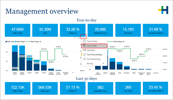
With the "Show Data" command you can display the data that is being used to create this visual. Right click on any place in the tile and select "Show Data" from the context menu. Alternatively you can use the edit menu:
The visual is now displayed in full-size and the used data is shown in a table below:
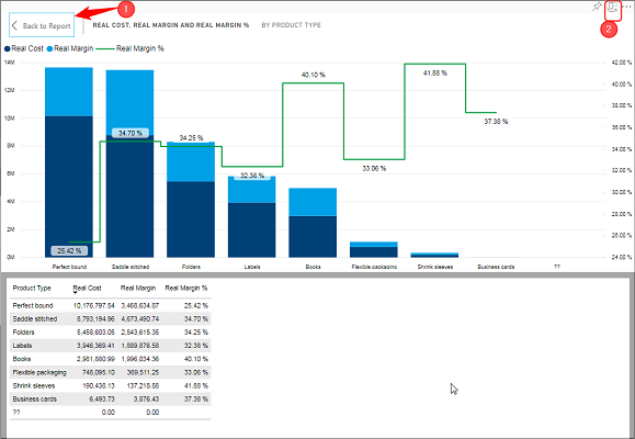
You can switch between a horizontal and a vertical layout with the button [2]. To return to the report page, click on the button "Back to Report" [1].
You can remove certain data points from a visual by right clicking on it and selecting "Exclude". If you select include on the other hand, only this data point will remain, while the rest is removed.
Some visuals offer you a drillthrough functionality. "Drillthrough" means that you are directed to a new page that shows you more information to a certain data point.
Here is an example:
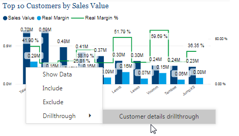
Right click on the customer "Talane". This visual offers you the possibility to drillthrough to the "Customer details" page:
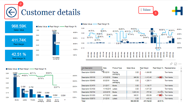
This page is identical to the "Customer details" page that you can reach through the register bar below, but it is already filtered to show only the results for the customer "Talane" [1]. In other cases the details page may be only accessible by drillthrough.
To go back to the previous page use the arrow button [2].
Filter area on the report page
Most preconfigured Smart BI reports have an area on the left where you can easily set some filter conditions. They differ from page to page.
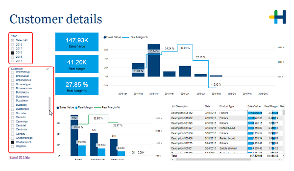
In this example you can set the year and the customer for which the data is displayed. There are filters where you can select only one option (recognizable by the black check box like in this example) and others where you can select a multitude of them (black check box with a white arrow).
Some may offer a "Select All" possibility. In this case you can select and deselect several options even for the filters that are meant to be single option (watch out: this can lead to nonsensical results.

Note: If no option is selected the accumulated data for every option is shown. There is no difference between no option and all options selected.
Power BI Filters
Another possibility to filter the data is using the Power BI filters. This function is advised for more experienced users.
Click on the arrow above "Filters" on the right side of your report page to expand the filter view:
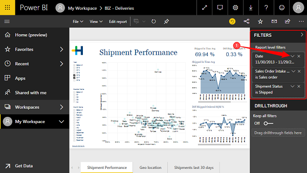
In this example there are three active filters: One for the date, one for the "Sales Order Intake Type" and one for the "Shipment Status".
1.Click on the arrow [1] to expand the view for this filter:
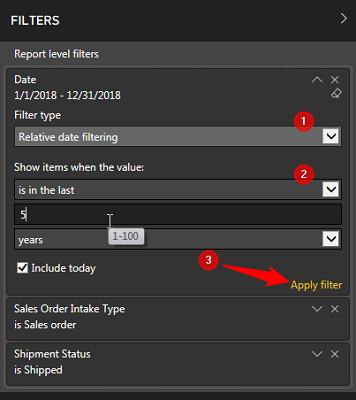
Define the filter:
2.Choose the "Filter type" [1]
You have the following possibilities:
·Basic filtering
When you choose "basic filtering" than every single value of this variable is displayed in a list. To restrict your data simply mark the respective values.
·Advanced filtering
This type offers you more possibilities to define the filter.
·Relative date filtering
Only for dates. You can filter the data dependent on the actual date. For example you can only show the data of this month or of the last x years.
3.Define the filter conditions under "Show items when the value:" [2]
The fields and drop down menus are depend on the filter type that you have chosen.
4.Click "Apply filter" to adopt the changes.
Note that the Power BI filters also effect the filter area on the report page.
When you hover over a visual an edit menu appears on top of it.
If that should not be the case you can change into the "Edit report" mode to see it.


|
Drill Up This button takes you up one hierarchy level. See Drill Down / Drill Up. |

|
Go to the next level in the hierarchy This button opens all next level items. See Show Next Level / Expand to next level. |

|
Expand all down in the hierarchy This buttons expands the visual with all next level items. See Show Next Level / Expand to next level. |

|
Click to turn on Drill Down When this button is activated every left click performs a drill down. See Drill Down / Drill Up. |

|
You can pin this visual to you personal dashboard. This is not possible in read-only mode. |

|
Use this button to examine the visual in full page mode. |

|
More Options •Export data •Show Data •Spotlight •Sort Descending •Sort Ascending •Sort by |
HD Privacy Statement | Imprint | Prinect Know How