
The diagrams and tables are shown in the central workspace. You can display them by clicking the appropriate item in the tabs or selecting the item you want in the "View" menu. To the right of the diagram, you can define various settings for viewing the color space.
You can display a context-sensitive Online Help with the "F1" key.
Display
Color names display to the right of the graphic with two boxes:
•right box: Check or uncheck the relevant boxes to select the colors that will be shown. The number of colors (process colors, mixed colors and/or spot colors) depends on the data sets you selected. It is possible to view a maximum of eight colors. The color names (if any) are taken from the data sets.
Note: If you use quality data from Image Control, you can also name the colors according to the set printing units as "X", "Z", "U", "V", "S1", "S2", etc.
•left box: You can show or hide the tolerances of the current process standard for the defined process colors by checking or unchecking the relevant boxes.
The name of the currently used process standard displays in the status bar. You can change the process standard or modify the tolerances in the "Process standard" main function. Then, in "Analysis", double-click the first row in the data table ("P" ID). Check the "Update process standard" box in the "Change entry" dialog and confirm with "OK". The inputs in the row change accordingly.
•"Mean": You can show or hide the calculated mean for color distance (mean ΔE value) for all color channels in the data series by enabling or disabling this option.
X-axis
The analysis reports are shown as time series. These are line diagrams with the horizontal axis forming the timeline. They are used to graphically illustrate time-based developments: to recognize a "trend". You can define how the timeline (X-axis) will be displayed by checking the appropriate box:
•Time: The timeline is defined in this case by the period that is defined by the date and time of the single data sets in the series (e.g. three days).
•ID: The timeline is defined in this case by the order of the single data sets in the series ("ID").
•Sheets: In this case, the timeline is defined by the sheet number. A difference is made here between front and back.
For example, to check the way linearization changes during a defined period, you can create the following series:
•Reference data: Nominal values or actual values after linearization. Ideally, these values are the same.
•Comparison data: Actual values after linearization at a regular interval, for example, after a couple of hours.
Y-axis
In the Preferences (General), you can set a fixed scaling on the Y axis to a defined maximum value for the trend, separately for the CIE, dot gain and/or density report. The Y axis is always scaled dynamically to a file-specific maximum value if this function is not enabled. The display is matched automatically after this function is enabled or disabled in the Preferences.
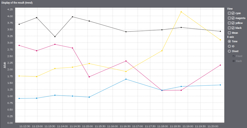
Example: Display of a CIE report without fixed axis scaling
The display pane is matched to the data-specific maximum value if the function is disabled.
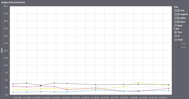
Example: Display of a CIE report with fixed axis scaling
When the function is enabled, the display pane always appears in the same size with a defined maximum value, irrespective of the current range.