Click the "Proof statistics" tab to view three diagrams with statistical results to compare the two data sets.
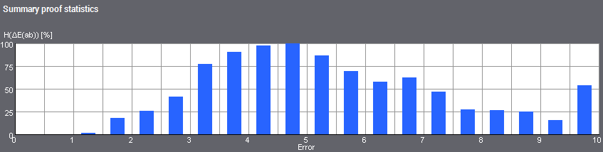
Summary proof statistics
The statistical results provide you with information about error distribution of the color data in the data sets.
For a comparison of both data sets, the values measured are used or the color deviations (differences in color) ΔE for the Lab color values are calculated from the measured color data of the test charts.
The statistical results appear in four areas:
•At the top, a histogram for error distribution (frequency distribution) of the ΔE deviations
•At the bottom left, a scatter diagram towards chroma (distribution of the Δa and Δb color differences)
•At the bottom right, a scatter diagram in relation to lightness (ΔL differences)
•In the column on the right, a display with different ΔE values
To the right of the diagrams is a column showing values that are calculated from the Lab color values of both data sets.
•"Mean": Mean of all ΔE values
•"StdDev": Standard deviation as the dimension for the scatter of the ΔE values
•"Max": Maximum error (greatest ΔE value)
•"White", "Black": ΔE values of white and black
•C, M, Y: ΔE values of the primary colors (cyan, magenta and yellow)
•R, G, B: ΔE values of the secondary colors (red, green and blue)
Display of the Error Histogram
You can view the frequency of actions in a histogram or bar graph. The frequencies can be specified as absolute values or relative (in percent) to the maximum frequency.
This histogram displays the frequency of errors. The error magnitude is depicted along the horizontal axis, in this case the values for color distance ΔE(ab) from 0 to 10. The vertical axis displays the frequency of these color distances. In other words, the histogram provides you with information about the number of color distances of a certain size.
You can assume that the color data of both data sets are well matched if the greatest frequencies are found in the low-range values and if the frequency tends towards 0 as the error magnitude increases. With identical data sets, there is only one bar at 0 as no color deviations can occur.
Display of the error distribution (trend)
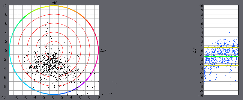
Scatter diagrams, also referred to as x-y diagrams, are used to provide a graphic display of data without trends or to detect first trends in data sets. Pairs of variates are entered as single dots in the scatter diagram.
In this scatter diagram, the error (differential value) is shown by a dot for each patch of the test chart.
You can read the error distribution from the diagrams:
•on the left, in relation to chroma (Δa and Δb differences)
•on the right, in relation to lightness (ΔL differences)
The more the values are scattered, the greater the deviations between the two data sets.
In the left diagram, you can recognize any color shifts by clouds of dots going towards a certain color (color cast).
The right scatter diagram has another two details:
•The green line marks the mean.
•The two yellow lines limit the area of standard deviation as the dimension for scattering.
If the dots are found mainly in the positive area, this means that the second value has become lighter; if the dots are in the negative area, the value has become darker. In this way, you can recognize errors, for example, in media simulation in proof profiles.