You can open this view by clicking the "Statistics" tab.
Display of statistical results
The statistical results provide you with information about error distribution of the two data sets. You can choose between three different diagrams:
•Histogram
•Trend
•Trend with mean
The error is selected by means of the following parameters:
•ΔE(ab), ΔE(2000): Color differences relating to Lab color values, calculation based on different definitions for color distances
•ΔL, Δa, Δb: Lab differential color values of reference and comparison data
•ΔC, Δh: Chroma and hue difference
In addition, the deviation is shown for the selected parameter, showing the mean, the standard deviation as the dimension for the scatter and the maximum value (specifying the patch number).
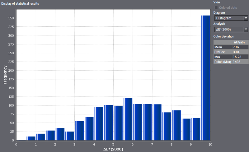
Display of the Error Histogram
You can view the frequency of actions in a histogram or bar graph. The frequencies are specified as absolute values in this diagram.
This histogram displays the frequency of errors of various differential values. The error magnitude is depicted along the horizontal axis, for example the values for color distance ΔE(ab) from 0 to 10. The vertical axis displays the frequency of these color distances. In other words, the histogram provides you with information about the distribution of errors of a certain size (in this case, the number of color distances). You can assume that both data sets are well matched if the greatest frequencies are found in the low-range values and if the frequency tends towards 0 as the error magnitude increases. With identical data sets, there is only one bar at 0 as no color deviations can occur.
In the "Parameter" box to the right of the diagram, you can select which errors will be shown.
Point the mouse at a bar in the diagram to display a tooltip showing the frequency and upper and lower limit of that bar.
Display of the error distribution (trend)

Scatter diagrams, also referred to as x-y diagrams, are used to provide a graphic display of data without trends or to detect first trends in data sets. Pairs of variates are entered as single dots in the scatter diagram.
In this scatter diagram, the error (differential value) is shown by a dot for each patch of the test chart or control element. Point the mouse pointer at these dots to display a tooltip showing the patch ID and deviation.
You can read the error distribution from the diagrams, for example, which patches have the greatest or smallest amount of errors.
The error distribution corresponds to the geometric arrangement of the patches in the test chart from top left to bottom right.
As a means of orientation, you can enable "Color dots" to see which patches are represented by dots. All the dots are shown in the color of the relevant patch in the test chart or test strip. An overview in the status bar shows the evaluated reference and comparison data. This is just the patches that are found in both data files.
The more the values are scattered, the greater the deviations between the two data sets. You can see this more clearly in the third diagram "Trend with mean".
Display of the error distribution (trend with mean)

In this scatter diagram, the calculated mean (olive-green line) and scatter (yellow lines) are added to the previous display.