Privacy Policy | Imprint | Prinect Know How | Prinect Release Notes ![]()
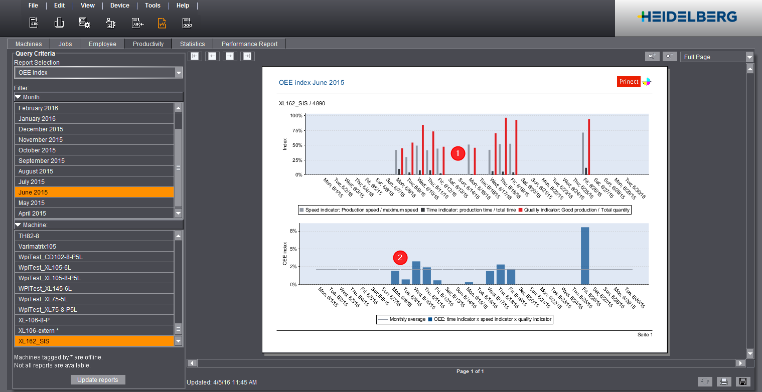
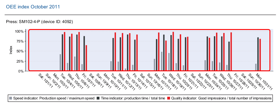
The OEE (Overall Equipment Effectiveness) index is the most familiar method of checking and improving the effectiveness of a press. The most frequent and most important reasons for a productivity loss of a press are categorized in three groups and visualized in three easy to read charts. You can evaluate the recorded data with these charts: how is the current situation, and where is room for improvement?
 Note: The OEE index is updated every hour. In other words: the latest values do not immediately appear in the report.
The OEE indicators are (1):
| Time |
| Speed |
| Quality |
We use these OEE indicators to analyze the effectiveness and efficiency of the press. The OEE index (2) is calculated from the OEE indicators. Calculations of the OEE indicators and the OEE index are described below. A detailed individual view of the OEE indicators is available at:
•Speed Index
•Time Index
Calculation of the OEE indicators
Objective of the OEE Evaluation
The OEE diagram shows the performance of your company's presses compared to the ideal press (index: 100%) for the selected month:
The ideal goal would be a press that produces only good sheets over the entire operating period (time indicator = 100%), at maximum printing speed (speed indicator = 100%) and does not produce any waste sheets during the operation (quality indicator = 100%).
Index of the OEE indicators
The diagram displays the following information for each day of the defined month:
•The average speed indicator (see also Speed Index)
•The average quality indicator (see also Quality Index)
•The average time indicator (see also Time Index)
Target:
The OEE index indicates how effective the selected press is compared to the ideal press.
The OEE index indicates where there is "room for improvement". Nothing can be improved that cannot be measured. In practice, an OEE index in the order of 30% (industrial commercial printing) and 40% (folding carton printing) can be expected.
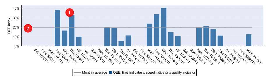
The chart shows the following information:
•The average OEE indicator for each day (1).
•The average OEE indicator for the entire month (2).
Privacy Policy | Imprint | Prinect Know How | Prinect Release Notes


