•Waste volume per operation during setup time
waste
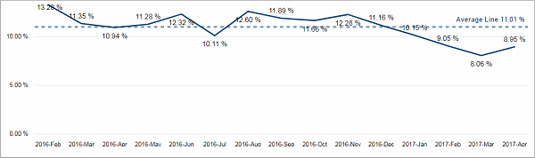
This chart shows you the waste percentage of the selected devices in the selected time period. It is displayed per month, but you can drill down to see it per weeks.
Facts & Dimensions:
•Y-axis [%]: Waste (%)
•X-axis [date]: Year Month
•Drill Down => X-axis [date]: ISO Week
This visual is filtered to only show the values from the execution time. If you want, you can adjust this setting in the filter menu.
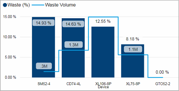
The columns show the waste percentage for each device. The corresponding scale is displayed on the left. The line indicates the waste volume for each device. Its scale is on the right.
This visual provides a tooltip. You can get additional information about the monthly waste percentage by operator when you move the mouse over the column of a device.
Facts & Dimensions:
•Y-axis Dark blue [%]: Waste (%)
•Y-axis (2nd) Light blue line [units]: Waste Volume
•X-axis: Device
Drillthrough:
Waste volume per operation during setup time
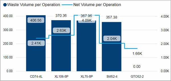
This visual is filtered to only show the values from the setup time. If you want, you can adjust this setting in the filter menu.
The columns show the waste volume per operation for each device. The corresponding scale is displayed on the left. The line indicates the net volume per operation for each device. Its scale is on the right.
This visual provides a tooltip. You can get additional information about the monthly waste volume per operation by operator when you move the mouse over the column of a device.
Facts & Dimensions:
•Y-axis Dark blue [units]: Waste Volume per Operation
•Y-axis (2nd) Light blue line [units]: Net Volume per Operation
•X-axis: Device
Drillthrough: