
•Net output per hour of net productivity per hour
•Effective Processing Time (h) of Production Time (h)
•Operating Time (h) and gross volume
Net output per hour of net productivity per hour
This gauge chart shows you the value for the net output per hour on a scale with a maximum value that is the net productivity per hour. See Definition of net productivity and net output.
If you want to look closer into the net productivity and net output, go to the page Speed by devices.
Facts & Dimensions:
•Gauge value [units/h]: Net Output (1/h)
•Maximum value [units/h]: Net Productivity (1/h)
Effective Processing Time (h) of Production Time (h)
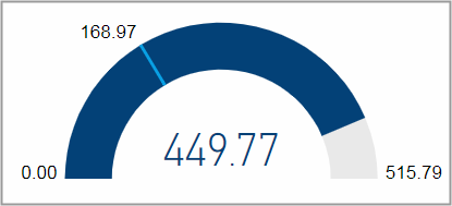
Effective processing time: hours from start to finish of an operation including stops.
Production time: hours spent producing excluding stops.
Operating time: complete time span from device switched on to device switched off.
This gauge chart displays the effective processing time on a scale with a maximum value that is the operating time. The production time is marked with a light blue line.
If you want to look closer into the time utilization, go to the page Utilization by Devices .
Facts & Dimensions:
•Gauge value [h]: Effective Processing Time (h)
•Maximum value [h]: Operating Time (h)
•Target value [h]: Production Time (h)
Operating Time (h) and gross volume
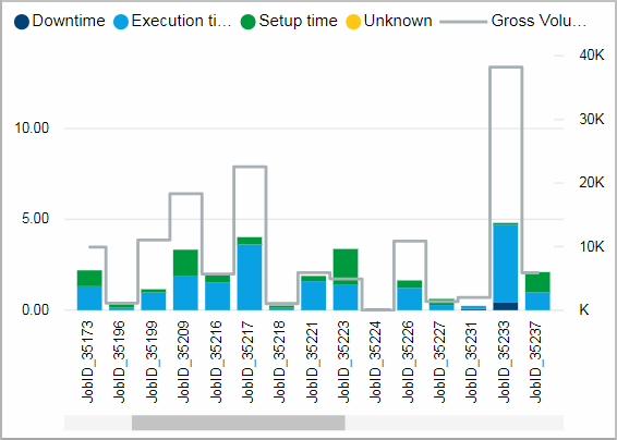
This chart shows the operating time and its distribution into Time types as well as the gross volume for single jobs.
It might be easier to look at this chart in full screen by using the focus mode.
Facts & Dimensions:
•Y-axis stacked columns [h]: Operating Time (h)
•Colors by: Time type
•Y-axis (2nd)Grey line [units]: Gross Volume
•X-axis: Job Number
Drillthrough:
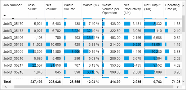
This table lists the shown data for each job.
Facts & Dimensions:
Drillthrough: