(Change language of this page to: English, Deutsch)
With this page you can identify your most productive device operators. It gives you a ranking by OEE and gross volume and by the respective OEE components.
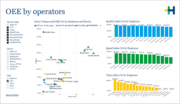
The big scatter plot shows you how well different operators performed regarding the OEE and the produced gross volume. The higher up and further right an operator is placed the better. The color of the dots represents the device. This way you can compare the operators on the same device as well as identify more productive machines.
The three column charts on the right rank the operators by the components of the OEE: quality, speed and time. Keep in mind that these values contain results for different devices which can make a direct comparison not viable.
In the filter area on the left you can adjust which devices and years are included in the charts.
See What is OEE?.