•Gross volume and OEE (%) by employee and device
•Quality Index (%) by employee
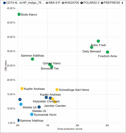
Gross volume and OEE (%) by employee and device
This scatter chart shows you how well different operators performed regarding the OEE and the produced gross volume for different devices. The higher up and further right an operator is placed the better. The color of the dots represents the device. This way you can compare the operators on the same device as well as identify more productive machines.
Facts & Dimensions:
•Y-axis [%]: OEE (%)
•Dots: Employee
•Colors by: Device
•X-axis [units]: Gross Volume
Drillthrough:
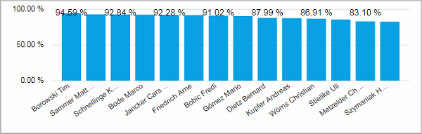
This column chart shows you a ranking of the operators by highest Quality Index calculated over all selected devices.
Facts & Dimensions:
•Y-axis [%]: Quality Index (%)
•X-axis: Employee
Drillthrough:
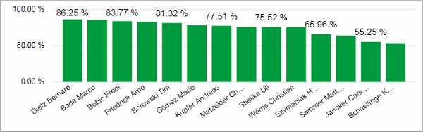
This column chart shows you a ranking of the operators by highest Speed Index calculated over all selected devices.
Facts & Dimensions:
•Y-axis [%]: Speed Index (%)
•X-axis: Employee
Drillthrough:
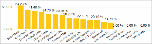
This column chart shows you a ranking of the operators by highest Time Index calculated over all selected devices.
Facts & Dimensions:
•Y-axis [%]: Time Index (%)
•X-axis: Employee
Drillthrough: