•Time Index by year and device
•Time Index by month and device
•Time Index compared to its rolling average
•Rolling average of the Time Index by quarter and device
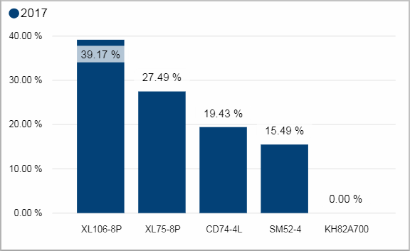
This clustered column chart shows the Time Index averaged over a year for each device. Each year is represented with a column
Facts & Dimensions:
•Y-axis [%]: Time Index (%)
•Colors by: Year
•X-axis: Device
Drillthrough:
Time Index by month and device
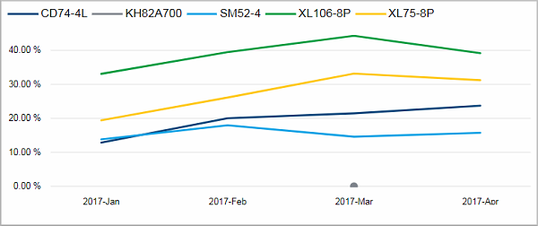
This line chart shows the Time Index for each month in the selected time period. The various devices are represented with different lines.
Facts & Dimensions:
•Y-axis [%]: Time Index (%)
•Colors by: Device
•X-axis [date]: Year Month
•Drill Up => X-axis [date]: Year Quarter
Drillthrough:
Time Index compared to its rolling average
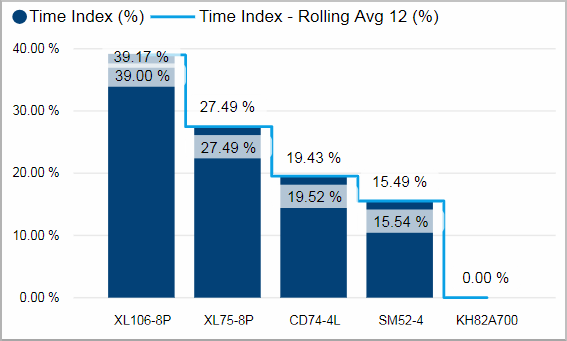
This chart shows the Time Index averaged over the selected time period for each device. The blue line indicates the rolling average over the last 12 months
Facts & Dimensions:
•Y-axis Dark blue [%]: Time Index (%)
•Y-axis Light blue line [%]: Time Index - Rolling Avg 12 (%)
•X-axis: Device
Drillthrough:
Rolling average of the Time Index by quarter and device
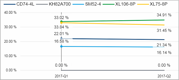
This line chart shows the rolling average of the Time Index for each quarter in the selected time period. The various devices are represented with different lines. You can drill down to see the results for each month.
Facts & Dimensions:
•Y-axis [%]: Time Index - Rolling Avg 12 (%)
•Colors by: Device
•X-axis [date]: Year Quarter
•Drill Down => X-axis [date]: Year Month
Drillthrough: