•[WORST 10] Waste percentage by operator
•[Best 10] Waste percentage by operator
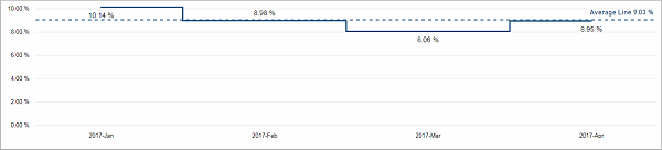
This chart shows you the waste percentage for each month. You can drill down to see it per week. The average waste percentage in the selected time period is marked as a dotted line.
Facts & Dimensions:
•Y-axis [%]: Waste (%)
•X-axis [date]: Year Month
•Drill Down => X-axis [date]: ISO Week
[WORST 10] Waste percentage by operator
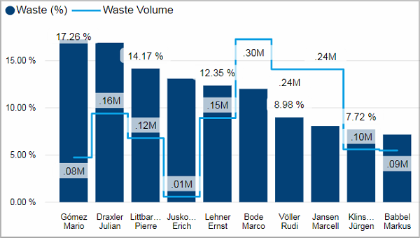
Here you can see a ranking of the operators that produced the highest waste percentage in the selected time period. Additionally, the total waste volume for each operator is marked with a blue line.
If you hover over a bar, a tooltip with a line chart displays that shows you the waste percentage of this operator by month and by device.
Facts & Dimensions:
•Y-axis Dark blue [%]: Waste (%)
•Y-axis (2nd) Light blue line [units]: Waste Volume
•X-axis: Employee
Drillthrough:
[Best 10] Waste percentage by operator
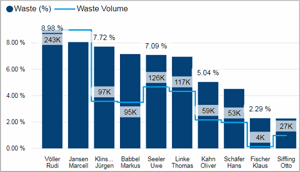
Here you can see the 10 operators that produced the lowest waste percentage in the selected time period. The employee with the best results is on the right side. Additionally, the total waste volume for each operator is marked with a blue line.
If you hover over a bar, a tooltip with a line chart displays that shows you the waste percentage of this operator by month and by device.
Facts & Dimensions:
•Y-axis Dark blue [%]: Waste (%)
•Y-axis (2nd) Light blue line [units]: Waste Volume
•X-axis: Employee
Drillthrough: