Operators ranking - map of speed and waste
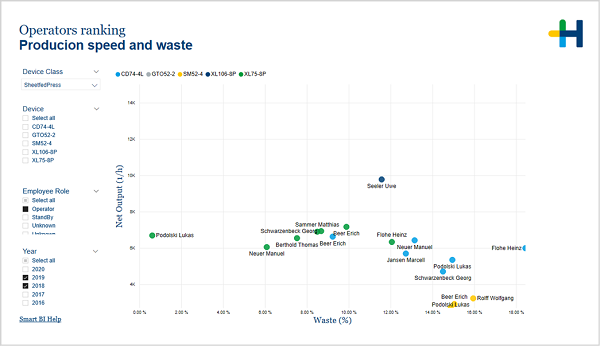
Operators ranking - Production speed and waste
(Change language of this page to: English, Deutsch)
The scatter chart on this page visualizes the net output speed and the waste percentage for each operator by device. It allows for a fast recognition of outliers.
This page presents both key factors (waste and speed) grouped by devices (shown in different colors). It helps you to judge the performance of operators in relation to others on the same device. The most interesting for further analysis are the ones far from main groups.
With the help of this page you can find out:
•Who is the leader, who hangs behind?
•Are the differences significant?
•Are operators predisposed to a specific device?
You can draw the following conclusions:
•If the differences are significant, some actions should be undertaken: additional training, transfer of knowledge from the best to others, etc.
•Choose the most effective combination Device-Operator
In the filter area on the left you can adjust which devices and years are included in the chart.
There are tooltips that show you the net output speed and waste percentage by month and device. To see tabular data, you can use "Show as a table" from the context menu.
Facts & Dimensions:
•Y-axis [units/h]: Net Output (1/h)
•Dots: Employee
•Colors by: Device
•X-axis [%]: Waste (%)
Drillthrough: