Operators ranking - map of production
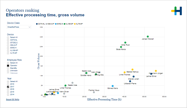
Operators ranking - Effective processing time, gross volume
(Change language of this page to: English, Deutsch)
The scatter chart on this page visualizes the gross volume and the processing time for each operator by device.
This page presents production figures grouped by devices (shown in different colors). It helps you to judge the performance of operators in relation to others on the same devices.
With the help of this page you can find out:
·Who has the best production results?
·If the production is proportional to the processing time?
In the filter area on the left you can adjust which devices and years are included in the chart.
There are tooltips that show you the gross volume and the effective processing time by month and device.
Facts & Dimensions:
·Y-axis [units]: Gross Volume
·Dots: Employee
·Colors by: Device
·X-axis [h]: Effective Processing Time (h)
Drillthrough: