•Net productivity per hour and net output per hour by month
•Net output per hour , net productivity per hour and net volume per operation by device
•Distribution of the operating time per device
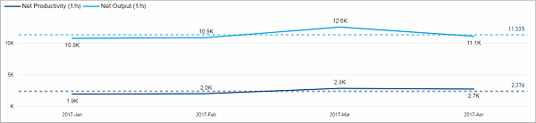
Net productivity per hour and net output per hour by month
This chart shows the net productivity per hour and the net output per hour over the course of time. To start with, the data is displayed per month but you can use "Drill Down" to see it per week.
Facts & Dimensions:
•Y-axis Dark blue line [units/h]: Net Productivity (1/h)
•Y-axis Light blue line [units/h]: Net Output (1/h)
•X-axis [date]: Year Month
•Drill Down => X-axis [date]: ISO Week
Net output per hour , net productivity per hour and net volume per operation by device
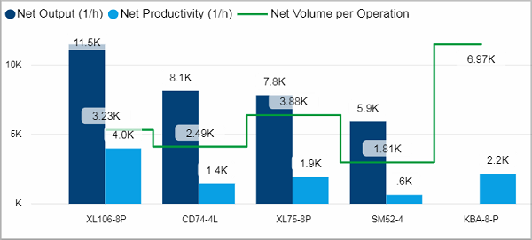
This chart shows you the net output per hour and the net productivity per hour for each device. Additionally, the net volume per operation count is displayed as a green line.
If you hover over a column, a tooltip is displayed that shows the course of the net output per hour of this device over time for each operator.
You can use "Drillthrough" to get more details about the respective device.
Facts & Dimensions:
•Y-axis Dark blue [units/h]: Net Output (1/h)
•Y-axis Light blue [units/h]: Net Productivity (1/h)
•Y-axis (2nd) Green line [units]: Net Volume per Operation
•X-axis: Device
Drillthrough:
Distribution of the operating time per device
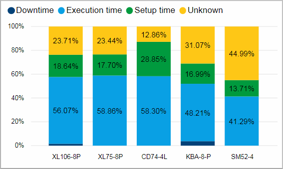
In this chart you can see how the time is distributed between downtime, execution time and setup time for each device.
This chart is equipped with an additional tooltip that shows you the distribution for this device for each month as well as the absolute values in hours.
Facts & Dimensions:
•Y-axis [%]: Operating Time (h)
•Colors by: Time type
•X-axis: Device
Drillthrough: