Map of utilization of devices - Do the most effective devices work maximum time?
(Change language of this page to: English, Deutsch)
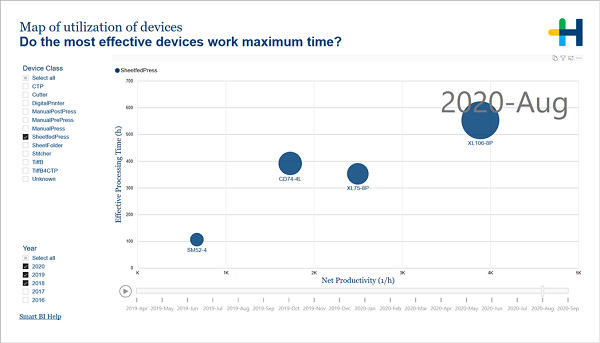
This page helps you to compare the net productivity and the time spent on processing jobs between devices.
In the filter area on the left you can adjust which devices and years are included in the charts.
This interactive chart places your devices according to their utilization. The effective processing time is shown on the Y-axis. This is the number of hours that the device was occupied by processing operations. The X-axis gives you the net productivity which is the net volume that was produced per hour of operating time.
The size of the bubbles corresponds to the number of operations that was processed on the respective device. All values are given for the month displayed in the upper right corner.
When you click the play button the bubbles move around in the chart according to the results of the particular month. You can stop the animation to investigate a specific month.
If you click on a bubble, its path during the months is plotted.
Facts & Dimensions:
•Y-axis [h]: Effective Processing Time (h)
•Dots: Device
•Colors by: Device Class
•Size by: Operation Count
•X-axis [units/h]: Net Productivity (1/h)
•Tooltip: Gross Volume
•Play Animation by: Year Month
Drillthrough: