•Net productivity per hour by device
•Waste volume and waste percentage by device
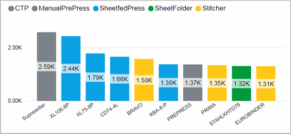
This chart shows the top 10 devices by hours of operating time. Devices of the same class are shown in the same color.
Facts & Dimensions:
•Y-axis [h]: Operating Time (h)
•Colors by: Device Class
•X-axis: Device
Drillthrough:
Net productivity per hour by device
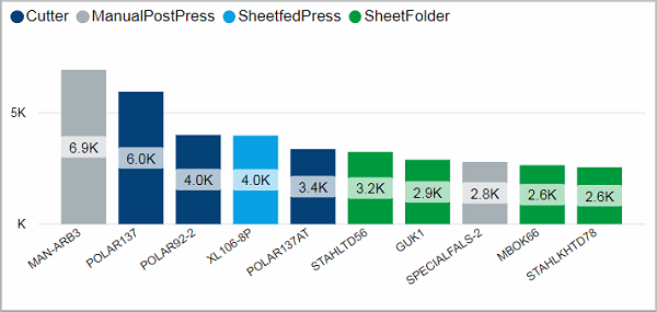
This chart shows the top 10 devices with the highest net productivity per hour. Devices of the same class are shown in the same color.
Facts & Dimensions:
·Y-axis [units/h]: Net Productivity (1/h)
·Colors by: Device Class
·X-axis: Device
Drillthrough:
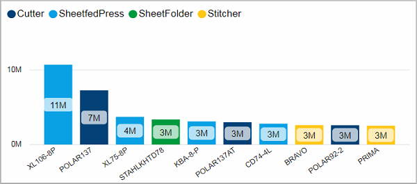
This chart shows the top 10 devices by produced gross volume. Devices of the same class are shown in the same color.
Facts & Dimensions:
•Y-axis [units]: Gross Volume
•Colors by: Device Class
•X-axis: Device
Drillthrough:
Waste volume and waste percentage by device
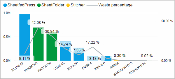
This chart shows the top 10 devices by produced waste volume for each device. Devices of the same class are shown in the same color. In addition, the waste percentage is plotted as a grey line.
Facts & Dimensions:
•Y-axis [units]: Waste Volume
•Colors by: Device Class
•Y-axis (2nd) Grey line [%]: Waste (%)
•X-axis: Device
Drillthrough: