
You can open this view by clicking the "CIE report" tab. It displays the overall result (Quality Check) of a comparison of measured data.
Display of the results (Quality Check)
When you open the reference and comparison data, an overview with the main results of the comparison then appears. Click the relevant tab on the left to view more details of the comparison.
You can print the view as a log (see General Information about Printing).
The result gives you an overview of how accurately the two data sets match each other and is divided into the following sections:
•Total results
•Dot gain at 25%, 40%, 50%, 70%, 75% and/or 80%
•Density values
•CIELab color values
•Analysis
•Proof report
For a better overview, these sections (except for "Total results") are minimized to a caption bar and can be shown or hidden by clicking this bar.
Note: In the "Preferences > CIE report" dialog (see 'CIE Report' Tab), you can select which sections will be shown by checking the relevant boxes.
An icon at the end of the bar shows you the result of the comparison:
|
|
No values available |
|
|
All the values are in the tolerance range. |
|
|
At least one value is not in the tolerance range. |
|
|
Only for proof report: |
The result refers to the four process colors cyan, magenta, yellow and black and is shown with the appropriate initial letters and color bars. To date, process standards are defined only for four-color printing with these colors. For that reason, spot colors ("Multicolor" option) are not shown in this dialog.
The broken lines on the bars mark a typical tolerance range. Small black arrows are used to highlight the differential values that exceed the bar graph.
If no color data is available, for example, with dotmeters, these values are shown in black and the other colors remain empty.

Note: For dotmeters, for example, the display of the results only contains the dot gain comparison. For that reason, switch to the dot gain and printing characteristic view for more details ("Tonal values" tab).
The overall result from all the evaluated data is indicated by a vertical black line on a color bar. The color bar goes from green to yellow to red and shows how well the data match each other. A black line in green means that the data are well to very well matched and, correspondingly, a line in red means a bad to insufficient match.

Note: The various data evaluated is weighted differently in the total result. Each result of the evaluated data contains precise details so that you can assess the quality of the data. The icons on the right of the caption bar give you an overview of the result.
"Show DotGain at xx%": This section displays the dot gain at 25%, 40%, 50%, 70%, 75% and/or 80% for cyan, magenta, yellow and black. The percent shown depends on what you set in the "CIE report" tab in the "Preferences" dialog.
The dot gains in the reference and comparison data and the calculated differential values "Δ" are shown in tables.
The difference in dot gain between the reference and comparison data is shown by bars to the right.
Normally, the dot gain is positive in normal printing processes, but it can also be negative (test strips, dotmeters). The display switches dynamically.
This section displays the solid tint density values for cyan, magenta, yellow and black. In addition, the difference in density between the reference and comparison data is shown in the "Δ" column and by bars on the right.
This section displays the solid tint CIELab values for the primary and secondary colors (black, cyan, magenta, yellow, red, green and blue) and also for paper white and CMY gray (Overprint).
The difference between the reference and comparison data is shown in the "ΔE" column and by bars on the right.
All the test chart or test strip patches that are in both the reference and comparison data are evaluated in the analysis and three statistical values are computed. Patches that are only in one file are ignored in the analysis. If patches have the same CMYK tonal values, the first patch with this value is evaluated in the analysis. The following values are shown in a table:
•the mean of the difference in color (mean ΔE)
•the scatter (standard deviation)
•the maximum deviation value
•the patch number with the greatest deviation (maximum)
The overall ΔE proof result gives you an overview of the most important color data.
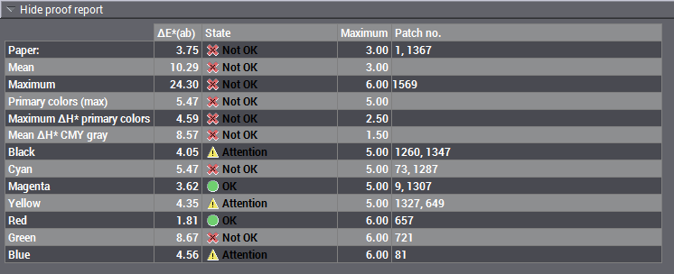
This simplified form of the in-depth single evaluations is based on the media strip method recommended by FOGRA for checking process standards. You can also view this on its own using the "Proof report" tab.
This proof report displays the color distances ΔE and the maximum value defined for the process standard as well as the patch number for the following parameters:
•Paper: paper white, printing material
•Mean value
•Maximum
•Primary colors (Max): CMY total
•Maximum ΔH primary colors: maximum hue difference of ΔE for primary colors
•Mean ΔH gray: mean hue difference of ΔE for grays
•Black, cyan, magenta and yellow: single results for the primary colors
•Red, green and blue: single results for the secondary colors
The "Status" of the result is also listed:
•Green circle and "OK": The ΔE value is less than the maximum value and, consequently, is within the tolerance range.
•Red circle and "Not OK": The ΔE value is greater than the maximum value and, consequently, is not in the tolerance range.
•Yellow triangle and "Attention": The ΔE value is (almost) the same as the maximum value and, consequently, is at the limit of the tolerance range.


