"Color settings" tab for toner-based digital presses (Heidelberg Versafire EP, EV, CP, CV)
We recommend the following training video:
Video Tutorial: Change 5th color
Change 5th color video
The setup parameters for the color settings are divided up into various groups that you can open by clicking the small triangles.
This is where you set up your input profiles for color management.
 CMY colors
This is where you define the source profiles solely for documents that contain CMYK colors.
"Enable CMYK Color Management" option
Use this option to specify that a CMYK input profile will be used for color conversion.

Note: Except for the selection of the input profile, the parameters for CMYK color management are also applicable for grayscales.
If this option is not selected, the documents are not processed with color management. This option is necessary, for example, if the digital print outputs are to be used for color calibration (e.g. with the Prinect Color Toolbox). In this case, the output documents may not be processed with color management. Neither a CMYK input profile nor an output profile will be used.

Note: Color management for documents with solely RGB and/or grayscale colors remains enabled even if "Enable CMYK Color Management" is disabled.
"Use Embedded Profiles" option
If documents containing colored objects or images are to be output, these objects are automatically converted so that they can be output in the CMYK or grayscale color space. The input profiles required for the input color space -> profile connection space transformation are usually included in the PDF documents and are used by color management. If the PDF documents do not have an input profile, you can use the standard input profile set by default or select a different one using the Browse button.
You use the "Use Embedded Profiles" option to define which CMYK input profile will be used:
•If this option is enabled and a device-dependent input profile is embedded in the PDF documents, then this profile will be used as the input profile.
•If this option is enabled and no input profile is embedded in the PDF files, the CMYK ICC profile selected in "If no profile is known" will be used for color management.
•If this option is not enabled, the CMYK ICC profile selected in "If no profile is known" will always be used for color management.

Note: The profiles that are selected are checked for suitability for the current context. A warning is issued if an unsuitable profile is selected.
You can create input ICC profiles – unless appropriate device profiles are already available – for example with the "Prinect Color Toolbox" and place them on the Prinect Server. The ICC profiles are saved in their subfolders in a folder below the path "PTConfig\SysConfig\Resources\ICC Profiles" (PTConfig is the shared configuration folder of the Prinect Server). This is where you can add custom ICC profiles and create appropriate folders if required.

Note: In "Administration" > "Resources" > "ICC Profiles" you can see an overview of all ICC profiles available in the Prinect workflow (see also ICC Profiles). You can also import new profiles, create a new profile folder, delete profiles, etc.
Separate input profile settings for image and text elements or graphic elements
By default, the "Input Profiles", "Rendering Intent" and "BPC" (black point compensation) parameters are available for CMYK and RGB colors for image, text and graphic objects. This means that the set parameters (input profile, rendering intent, black point compensation) are valid for image, text and graphic objects.
Click the plus sign beside the "Images" icon to display the same parameters for image elements and for text/graphic objects separately. In this way, you can set up the input performance of color management separately for image/text objects and for graphic objects.
The settings that currently can be seen always affect color management.
•Collapsed (plus sign displays): joint settings for image, text and graphic objects.
•Expanded (minus sign displays): separate settings for image objects and text/graphic objects.
In addition to selecting ICC profiles, you can set the rendering intent for the colored objects. Rendering intent determines how color matching is done. Since losses always occur during a color space transformation, it can be helpful, for example, to retain the photographic perception of an original and to accept a limit on the number of color values. The following parameters are available for rendering intent: "Perceptual", "Saturation", "Relative Colorimetric" and "Absolute Colorimetric":
•Perceptual
When you use the "Perceptual" parameter, you obtain an output, that essentially contains the perceptible impression of the original. This means that the precise, colorimetric rendering of the colors is modified in favor of the retention of the relative color relationships. In a smaller target color space, the color gamut is compressed accordingly. Vice versa, in a larger target color space and with suitable profiles, the color space may be expanded. With this color matching option, the hue in all the natural colors of the original is reproduced for the most part correctly but with restrictions in the contrast. The type of color matching is manufacturer-specific, with the user being able to set some of the aspects such as contrast and chroma change during profile generation. This option is especially suitable for photographs.
•Saturation
In the output, the colors are rendered in such a manner that the color saturation is retained or even emphasized. The type of color matching is manufacturer-specific, with the user being able to define some settings during profile generation. This option is suitable for business graphics where the color saturation is the most important attribute in color rendering.
•Relative colorimetric
Colors are rendered taking solely the light source into account. The rendering intent of the print medium (e.g. the color of the unprinted paper) is not taken into account. For example, the illuminant of a monitor would be correctly rendered on the print medium. That is why the term "relative" is used. All colors that lie within the output color space are rendered identically. All colors that lie outside of the target color space are displayed on the margin of the target color space. That is why the term "colorimetric" is used.
The advantage of this rendering intent is that different illuminants of different output media are taken into account. The disadvantage is that the color adaptations are not exactly retained when switching from one output medium to another. As a result, very dark or very colorful details in the originals can be lost when they are reproduced. The substrate is not simulated during an output process simulation. If production run paper is used during the simulation, the result is the same as if you used the "absolute colorimetric" rendering intent. This rendering intent is suitable mainly for vector graphics.
•Absolute colorimetric
Colors are rendered taking the light source and the medium illuminant (e.g. the color of the unprinted paper). For example, the illuminant of a newsprint paper which is shifted from illustration printing paper towards yellow compared to the illuminant of paper is rendered with a yellowish cast. That is why the term "absolute" is used. That is why "Absolute colorimetric" is the default setting for a proof output. All colors that lie outside of the output color space are displayed on the margin of the output color space.
The advantage of this rendering intent is that the exact color values are retained when switching from one output medium to another. The disadvantage is that any colors that lie outside of the output color space cannot be distinguished. This rendering intent is especially suitable for logos or monochrome objects which must be reproduced exactly the same way on different output media.

Note: "Absolute colorimetric" is always set as the rendering intent for spot colors. This makes sure that the spot colors are simulated as best as possible.
•From Document
The Color Rendering Intents that were defined for images and graphics in the PDF documents are used. Normally, "relative" is set as the rendering intent in the PDF documents. However, different rendering intents may have been assigned to single objects. In such cases, the object-related rendering intent is used if this option is set. If necessary, you can check such PDF documents in advance, for example, with the Prinect PDF Toolbox.

Note: You should select "From Document" only if you are sure that the edited documents have rendering intent settings that can correctly control the color space conversion desired. However, if this is not sure, you should not use this setting if possible.
"BPC" (black point compensation) option
Black point compensation (BPC) becomes active if you enable the "BPC" option. You can enable black point compensation (BPC) for "Relative Colorimetric" "Perceptual" and "Saturation" rendering intents. However, the effect of this option can only be seen for the rendering intent "Relative Colorimetric".
In gamut mapping, all L shadows (in the L*a*b* color space) that are darker than black toner/ink are matched to black toner/ink and, as a result, shadow definition is lost.
Black point compensation enhances the reproduction area when the "Relative colorimetric" rendering intent is used for color space conversion to the L*a*b* color space or from the L*a*b* color space to the device color space. The L*a*b* color space has more lightness levels for dark image parts than the CMYK color space because the L*a*b* color space is larger than the CMYK device color space. In a color space conversion from the L*a*b* to the CMYK color space with "Relative Colorimetric" rendering intent, the color space is cut off or reproduced without definition in the shadows because they are located outside the displayable range. As a result, details in dark parts of the image are often lost, especially if ICC profiles for uncoated papers are used for color space conversion.
Black point compensation matches the black point during color space conversion, causing the definition in such dark image parts to be kept. This "elongates" the shadows causing color shifts to occur also in the lighter color values. For that reason, this method is not always suited to true-color proofing.
We recommend that you use "Perceptual" rendering intent with black point compensation and not "Relative Colorimetric" rendering intent. This rendering intent makes it possible for the various details in dark image parts to be reproduced, while keeping color shifts to a minimum. In principle, differences cannot be fully avoided because of the different sizes of the color spaces.
When this option is enabled, CMY in solid tint single-color or two-color image parts is kept.
Normally, if color management is used, C=100, M=0, Y=0, K=0 becomes, for example, C=96, M=12, Y=8, K=2. In other words, "dirtying elements" creep in. These elements are fully correct if you have a true-color display. However, this behavior may not be wanted in technical diagrams because color margins occur at the mainly clearly defined edges, for example, due to register errors or if the maximum color of the original printing process is to be retained for this color area.
"Primaries (solid)" selected
Cyan, magenta, yellow and black (K) are the primary colors in the CMYK color model. When this is selected, only the solid tint primaries with a value of 100% are kept in their original color percentages, meaning that they are not changed by color management. Example: 100% magenta.
"Primaries (all)" selected
When this is selected, all the primaries (including those less than 100%) are kept in their original color percentages, meaning that they are not changed by color management. Example: 70% magenta.
"+ Secondaries (solid)" selected
Secondary colors are colors that result from mixing two primary colors (C, M,Y). Secondary colors are "red" (C=0, M=100, Y=100), "green" (C=100, M=0, Y=100) and "blue" (C=100, M=100, Y=0) in the CMYK color model.
The preservation of secondary colors is always in addition to the preservation of primary colors. This is highlighted by the prefixed plus sign.
When secondary colors (solid tint) are preserved, solid tint secondaries each with 100% are kept in addition to the primaries, e.g. blue (C=100, M=100, Y=0, K=0).
By clicking the plus sign in front of the list box, you can set up that CMYK colors will be kept separately for images and graphics.
"+ Secondaries (all)" selected
When secondary colors (all) are preserved, all the secondaries are kept in addition to the primaries, even if originally they are not made up of 100% primaries. For example, red (C=0, M=80, Y=80, K=0) doesn't change.

Caution: You should enable the preservation of primary / secondary colors only if, for technical reasons, the colors really have to be kept and not be influenced by color management. You should never enable these options by default as otherwise you can have results that you may not want in your printing.

Note: Objects or documents in the "Gray" color space are not handled by color management if "Preserve colors" is enabled.
 RGB colors
"Use Embedded Profiles" option
This option lets you define which RGB input profile will be used:
•If this option is enabled and a device-dependent input profile is embedded in the PDF documents, then this profile will be used as the input profile.
•If this option is enabled and no input profile is embedded in the PDF files, the RGB ICC profile selected will be used for color management.
•If this option is not enabled, the RGB ICC profile selected will always be used for color management.

Note: The profiles that are selected are checked for suitability for the current context. A warning is issued if an unsuitable profile is selected.
Apart from this, the annotations made for CMYK colors are applicable for profile selection, rendering intent and black point compensation. See "Use Embedded Profiles" option.
 Keep Black

Note: If PDF documents with grayscale content are output, normally black in the CMYK input profile is used for grayscale color management. Exception: If you enable "Keep Black in Images" or "Keep Black for Text / Graphics", the settings of the input profile are not used for color management.
"Always Keep Black on B/W Pages" option
When you enable this option, all pages that only have the black separation are printed solely with "Black". If a PDF document has both colored and black-and-white pages, the black-and-white pages, e.g. pages with just text, are printed automatically only with "Black" while colored pages are printed in color. Generally, you should always enable this option.
If this option is enabled, only C, M and Y are converted to the target CMY color space in images, K is not converted. Black remains identical.

Note: This setting can cause issues during an output if the black inks have different densities in the original and target color spaces.
This is a special setting that works as follows:
•C, M, Y are converted to the target CMY color space for mid-range and light hues. K is converted by means of a gradation curve.
•A special four-dimensional model keeping K is used for dark hues.
Extensive test series have shown this process to be the best. This setting eliminates most of the problems in complex documents. This function is available only in Heidelberg's color management. This setting is suitable for documents with text, color and gray images.
"Keep Black for Text / Graphics" option
If this option is enabled, color management does not affect black in the text or graphic objects. The following options are available for this:
•All
Black defined for output is kept in its original form for all text and/or graphic objects that only contain black. In other words, color management does not affect black definition.

Note: If "Keep Black for Text / Graphics > All" is enabled and a page has no other separations except for black, this is highlighted in the preview by a black separation icon.

This lets you see right away whether a sheet with apparently black content really only contains the black separation. Otherwise it might be printed unintentionally in several colors.
•Keep 100% Black
When enabled, this option has the following impact: If black is defined as C=M=Y=0 and K=100% or as R=G=B=0 and/or gray=0 in text or graphic objects, black is kept as 100% black or the colors are set to C=M=Y=0 and K=100%.
"Black Overprint" option for text / graphics
The "Overprint" function is mostly used to avoid register problems and flashes in black fonts and other black graphic objects that lie on top of a colored background. For design purposes, overprint is also used with hard shadows or colored CMYK objects. You can control overprint best if it is set directly in the application that creates the job.
The overprint settings of the Prinect Color Management on the one hand compensates for application shortcomings and on the other processes faulty documents so that you get the overprint effect you want. It's not possible to detect on a page which object is to overprint and which not. For that reason, these settings are not sufficient in some individual cases.
All black elements defined as knockout are set to "overprint" if this option is enabled.
This option affects the following color spaces: "DeviceCMYK" with C=M=Y=0%, "DeviceGray" or "/Separation/Black". You can use this option specifically on text and/or graphic objects.
Behavior when processing jobs that were defined in version 2017 and contain PagePrint and/or ImposedPrint sequences
The color settings in the "Digital Printing" step have changed in version 2018 compared to the predecessor version. If such jobs are to be processed with version 2018 or higher, the parameters that no longer exist in the current version are processed as follows:
|
Version 2017 |
Version 2018/2019 |
|---|---|
|
Images: |
|
|
"Preserve colors > Keep Black" disabled |
"Keep Black in Images" disabled |
|
"Preserve colors > Keep Black > K=K" enabled |
"Keep Black in Images" enabled |
|
"Preserve colors > Keep Black > Special" or "Basic" enabled |
"Keep Black in Images > Match Lightness" enabled |
|
Text / Graphics: |
|
|
"Policy for 100% black in text / graphics > No special policy" enabled |
"Keep Black for Text / Graphics" disabled |
|
"Preserve colors > Keep Black > Special" or "Basic" or "K=K" enabled |
"Keep Black for Text / Graphics" enabled > "All" enabled |
|
"Policy for 100% black in text / graphics > Keep 100% Black" enabled and "Preserve colors > Keep Black" disabled |
"Keep Black for Text / Graphics" enabled > "Keep 100% Black" enabled |
The setting options display when you click the triangle.
In this group you specify whether varnish, white and/or spot colors defined as "DieLines" will be printed.
The settings for varnish or for white display depending on the features of your press.
"Remove Transparent Spot Colors" option
Spot colors can be defined as "transparent". This is set in "Colors" in the job settings. See Type. Generally, transparent spot colors are used as varnishes.
When this option is enabled, all spot colors defined as "transparent" are removed from the printing data. You should enable this option if the press has no coating unit.
You must disable this option if a coating unit is available and if it is to be used to output transparent spot colors.

Prerequisite: This option is available only if output to a digital press with a coating unit is set up (using a PagePrint or ImposedPrint sequence), e.g. Heidelberg Versafire EV or CV.
The coating unit is enabled for printing when you enable this option. Varnish is handled as an additional spot color. This requires that the spot color is defined as "transparent". In addition, "Usage" should be set to "Special, printing unit". These data are set in "Colors" in the job settings. See Usage.

Prerequisite: This option is available only if output to a digital press with an inking unit for "White" spot color is set up (using a PagePrint or ImposedPrint sequence), e.g. Heidelberg Versafire EV, CV or Primefire 106 or Labelfire 340.
The white inking unit is enabled for printing when you enable this option. White is handled as an additional spot color. This requires that the spot color is defined as "opaque". In addition, "Usage" must be set to "Special, printing unit". These data are set in "Colors" in the job settings. See Usage.
Video Tutorial: Change black-and-white:
Change black-and-white video

Prerequisite: This option is available only for Versafire EV presses and only if a special inking unit with a "Ricoh Other" toner is installed.
Versafire EV digital presses support the "Ricoh Other" toner in addition to the "Varnish" and "White" special toners. With this option, you enable that this special toner will be applied to the whole surface. To be able to output a color as "Special", you must have set "Usage" to "Special, printing unit". This is set in "Colors" in the job settings. See Usage.
When this option is enabled, all toners marked as "Ricoh Other" are output.
"Low Inking" / " High Inking" options

Prerequisite: This option is available only for Heidelberg Versafire CV presses.
You define the quality of varnish and/or white with this toggle button.

Note: "Print Varnish" and "Print White" can be enabled at the same time. This parameter affects output depending on which option is set in the print job and which varnish color is available on the press.
"Apply varnish all-over" parameter

Prerequisite: This option is available only if output to a digital press with a coating unit is set up (using a PagePrint or ImposedPrint sequence), e.g. Heidelberg Versafire CV/EV.
This option lets you apply varnish to the whole surface, on the front and/or back of the set paper grade (see "Paper" list box). If different paper grades are used for the cover and the body, this option lets you set that varnish will be applied to the whole surface separately for each of these paper grades.
"Apply white all over" parameter

Prerequisite: This option is available only if "Print White" is enabled.
With this option, you can set that white will be applied to the whole surface for digital presses that have a white inking unit. For example, this lets you print transparent films with a white background and then overprint this background with color.
For cover and body paper grades, you can also set this option separately for front and back.
"Apply Special all over" parameter

Prerequisite: This option is available only for Versafire EV presses. You can use it only if "Print Special" is enabled. See "Print Special" option.
Versafire EV digital presses support the "Ricoh Other" toner in addition to the "Varnish" and "White" special toners. With this option, you enable that this special toner will be applied to the whole surface. You can enable that it will be applied to the whole surface separately for the front and/or back.
For [paper grade]
If different paper grades are used for the cover and the body, you can set each of these paper grades separately with this option. The paper grade displays accordingly.
"DieLine" spot colors will not be printed when this option is enabled.. The "DieLine" spot color is usually used as a proof color in PDF documents, for example, to display proof marks. If a proof is to be made of the current print job, you can disable this option for proofing. You should enable this option for the production run.
"Map Spot Colors to Process Colors" option

Prerequisite: This option is available only for generic digital presses, i.e. for the "Generic" machine model that was set up without being specified for a particular digital press. In the system settings, devices of this kind are set up in the CDM with the device name and "Generic" as the machine model.
When this option is enabled, spot colors are not output as separate color separations but are converted to CMYK colors.
The impact of this option is visualized in the sheet preview.

Note: The spot colors that are set in "Colors" in the print job are always used in the "Digital Printing" step (see "Colors" Section).
•PDF documents generally have "recipes" for replacing the spot colors in the document by process colors (CMK replacement). In other words, each spot color in the document has set CMYK values that replace this spot color. In "Colors" you can set which replacement policies will be used, those in the job settings or those in the PDF documents.
•The "Administration" section of the Prinect Cockpit also has recipes for spot color replacement in "Color Tables". In "Colors" you can set which replacement policies will be used, those in the job settings or those in "Administration > Color Tables".
This function gives you the option of checking the accuracy with which spot colors can be simulated in digital printing without having to output test prints.
The ΔE 2000 values display for each spot color for the set paper grade (see "Paper" list box). If different paper grades are used for the cover and the body, these values display separately for each of these paper grades. The ΔE 2000 value displayed is red if it exceeds a critical amount.
"Spot Color Matching" function
You can use "Spot Color Matching" if you need special settings for spot color replacement. This function lets you customize the settings for replacing spot colors in your current print job.

Note: If a color profile is set in the job and it deviates from the output profile defined in the digital print settings of the Prinect Manager, then a warning is issued whenever you try to open the "Spot Color Matching" dialog. This warning draws your attention to the fact that spot color matching is not possible because of the different color profiles. You can choose to apply the output profile of the Prinect Manager for spot color matching or to cancel spot color matching.
We recommend that you have a probe of the correct spot color in the original on hand before you start color matching to be able to compare the printouts of the test charts with this probe.

Note: The settings always relate to a specific paper grade on a specific press.
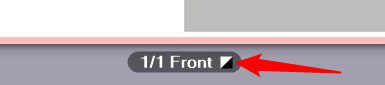
1.Click "Spot Color Matching".
The "Spot Color Matching" dialog opens.

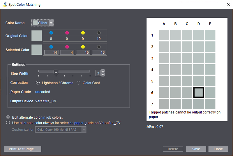
2.In the "Color Name" list box, first select the spot color for which you want to define a substitute color. All the spot colors that are in the current print job are listed.
The original color displays in "C4", the middle color patch. Modified colors display around the original color. Colors that cannot be output correctly to the paper set in the print job are marked by an "x".
The ΔE 2000 value of the currently selected color patch displays below the color patches. When you move over a different color patch with the mouse cursor, the current ΔE 2000 value of this patch displays. This is a fast way to view the differences to the original color and find an optimal substitute color.
The aim of these settings is to determine a color that optimally replaces the original spot color, allowing it to be output correctly (in other words, a color that is not marked by an "x").
3.Click "Print Test Page".

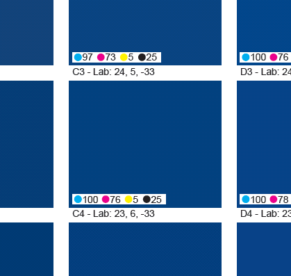
Note: Each color patch in the test charts is labeled with the CMYK and L*a*b* values of the color. This makes it easy to apply the color values to the print job.

·A test chart is printed immediately if the job does not have any spot colors.
·The "Print Test Page" dialog displays if the job has one or more spot colors:

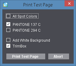
This is where you can set that test charts will be printed for all spot colors at the same time or for one or more spot colors.
"Add White Background" option
The test page can be given a white background to enhance the color impression when assessing a spot color, for example, when printing to foil.

Prerequisite: The "Add White Background" option is available only for presses that have an inking unit for "White" (e.g. Versafire CV/EV, Labelfire 340).
Enable "Add White Background" to use this function.
"TrimBox" option
The trim box is also output with cut marks when you enable this option. This makes it easier to cut the test prints, if required.

Note: Each test chart printout creates a new separate print job in the Prinect Manager. These test chart print jobs are set up with the color settings that are required for a true-color output.
4.Now compare the printout of the test chart with the original copy and determine the color patch that best matches the original spot color.
5.If the deviation is still too big, enable either "Lightness/Chroma" or "Color Cast" in "Correction" to set the type of color change. Now move the "Step width" slider until suitable patches display in the preview window. The bigger the step width, the greater the differences between each of the color patches.
6.Repeat steps 3 and 4 until you are satisfied that the target color is determined accurately enough. On the test chart, the patch with the correct color has an "address", e.g. "D6".
7.Click the "D6" patch in the "Spot Color Matching" dialog.
The CMYK values or the L*a*b* values (whichever one is defined) of the original color display in "Original Color". The values of the selected color display accordingly in "Selected Color" (in our example, those of "D6").

Note: The values of the target color are always specified as CMYK values even if the original color is set in the L*a*b* color space (exception: inkjet presses, see below).
8.Enable "Edit alternate color in job colors" if you wish to set the alternate color only for the current print job.
If the alternate color is always to be set for the paper grade used, enable "Use alternate color always for paper grade "..." on (...)" and select the paper grade that will be used for printing the test page in the "Customize for" list box. Then these settings affect all print jobs that are printed with this paper grade on this press. This setup is applicable until you edit it again.
9.If you are satisfied with the colors selected, confirm the dialog with "Save".
10.Use the "Delete" button to reset all the settings so that special spot color settings are no longer defined for the particular paper grade/press combination.
The "Paper Grade" and "Output Device" boxes are for your information only.
This is where you can define the output profile of color management, in other words the target color space of printing. This output profile affects all outputs on the set paper grade. The paper grade is shown.
"Automatic Selection by Paper Type" option
When you enable this option, color is matched automatically to the color profile of the selected paper grade. This requires that the paper grades used are characterized. In other words, there is a suitable color profile that is matched as best as possible to the color reproduction properties of the paper. Normally, this is the best setting for color management.
There are the following options for automatic paper selection:
•In the profile folder of the digital press type (e.g. PTConfig\SysConfig\Resources\ICC-Profiles\Printer\Digital\EV), there is a characterized "custom profile" for the selected paper grade ("custom1.icc", "custom2.icc", "custom3.icc", etc.). This profile is then automatically selected.
•If the profile folder has a folder with the device name of the digital press and if this folder has a profile with exactly the same name as the paper selected, then this profile is selected automatically in preference to a custom profile. Such paper profiles are written by the Digital Engine Manager to the correct position in the file system. Example for such a file path with a profile for "A4LEF" paper grade: "PTConfig\SysConfig\Resources\ICC-Profiles\Printer\Digital\EV\MyVersafireEV\A4LEF.icc".
•If there is neither a profile with a name matching the paper grade nor a custom profile, a standard isotype profile matching the paper grade is selected if "Automatic Selection by Paper Type" is enabled.
The profile set displays in "Other Profile".
"Convert to Gray" option
When you enable this option, the job or component job (cover or content) is output as a grayscale even if it contains color pages. This setting displays in the preview.
You can use this option, for example, if you want the cover of a product to have a different paper and/or color setting to the content (see "Cover" option). In this case, you can select an alternative output profile for the cover.
Default:
Normally, an all-round output profile matching the paper grade is set by default (isotype 1.icc, .., isotype4.icc). Instead of the all-round profiles, you can also create separate output profiles matching the paper grade used and load them as a default. Proceed as follows:
1.On the digital press with the intended paper grade, create an output ICC profile in each case and name these profile files "custom1.icc", "custom2.icc", "custom3.icc" or "custom4.icc".
2.Copy or move these profile files to the folder of digital printing ICC profiles, e.g. "E:\PTConfig\SysConfig\Resources\ICC Profiles\Printer\Digital\CV".
If you now enable "Automatic Selection by Paper Type", the custom output profile matching the selected paper grade is automatically set by default.

Note: The selected profiles are checked for suitability for the current context. A warning is issued if an unsuitable profile is selected.
"Profile Customization" function
The "Profile Customization" function lets you fine-tune the currently set output profile under visual control on the screen when needed. The following dialog opens when you click the "Profile Customization" button:
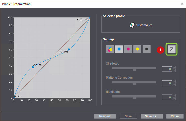
The name of the active profile displays at the top right.
In "Settings" you will find the toggle (1) for switching between freehand and slider operation of profile customization.
Freehand mode:
1.The sliders are disabled in the freehand mode and you can modify the curve by dragging it while holding down the left mouse button. This creates an "anchor point" and the related coordinates display (in percent). You can create several anchor points by clicking and dragging a number of times.
2.You can remove each anchor point with "Remove" in the context-sensitive menu over the anchor point.
3.The page displayed in the preview is matched to the new color profile settings when you click "Preview". This lets you check the effect of the edited color profile.
Slider mode:

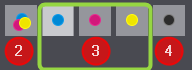
1.You can use the sliders for "Shadows", "Midtone Correction" and "Highlights" jointly for CMY (2) or separately for C, M, Y (3) and K (4) when you click the toggle button (1). This lets you set the parameters using sliders. The sliders have the following impacts:
·Shadows: This slider changes the value of the curve at 75%. The values can be changed between -20% and +20%.
·Midtone Correction: This slider changes the curve at 50%. By doing this, the whole curve can be moved up or down, meaning that other values of the curve are matched. The values can be changed between -30% and +30%.
·Highlights: This slider changes the value of the curve at 25%. The values can be changed between -20% and +20%.
The impacts of the changes made with the sliders display immediately in the preview.
2.A slider is reset to its middle position when you double-click its name or the slider itself.
You can save the modified color profile if you are happy with the settings. The mode (freehand or slider) that is currently set is the one that has an impact. The color profile will be overwritten when you click "Save". You cannot overwrite a standard profile installed by default with "Save". Click "Save as" to save the modified color profile under a different name on the Prinect server. The profile can then be used again for subsequent jobs.
Click "Close" to close the dialog. A message appears if changes were made but not saved.


