•Waste volume by device and year
•Impact of each device on the yearly waste percentage
•Waste percentage by device and year
•Waste volume per operation by device and year
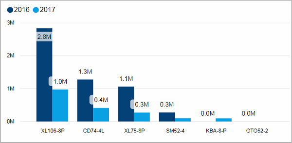
Waste volume by device and year
This column chart shows you the waste volume per year for each device. Each year is represented with a different color.
Facts & Dimensions:
•Y-axis [units]: Waste Volume
•Colors by: Year
•X-axis: Device
Drillthrough:
Impact of each device on the yearly waste percentage
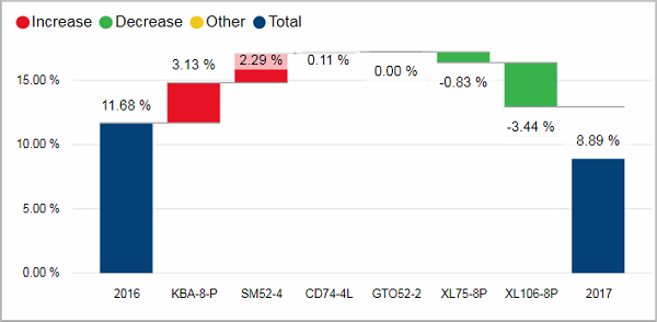
This waterfall chart shows the combined waste percentage per year. In between the years the floating columns show the impact of each device on the change of the waste percentage. See Waterfall charts.
Facts & Dimensions:
•Y-axis [%]: Waste (%)
Waste percentage by device and year
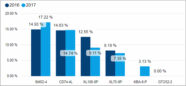
This column chart shows you the waste percentage for each device. Each year is represented with a different color.
There is a tooltip for more insight into the history of the waste percentage: Waste percentage by month and operator.
Facts & Dimensions:
•Y-axis [%]: Waste (%)
•Colors by: Year
•X-axis: Device
Drillthrough:
Waste volume per operation by device and year
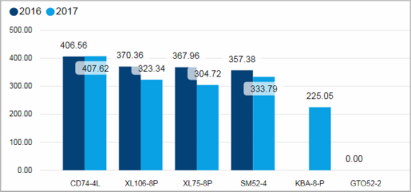
This column chart shows you the waste volume per operation for each device. Each year is represented with a different color.
There is a tooltip for more insight into the history of the waste volume per operation: Waste volume per operation by month and operator.
Facts & Dimensions:
•Y-axis [units]: Waste Volume per Operation
•Colors by: Year
•X-axis: Device
Drillthrough: