•Gross Volume and Operation Count by device
•Gross Volume by day and device
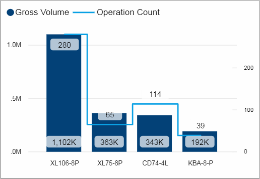
Gross Volume and Operation Count by device
This visual shows you the gross volume and the operation count during the last 10 days for each device.
Using the tooltip you can see a visualization of the devices Waste Volume per Operation by day.
Facts & Dimensions:
•Y-axis Dark blue [units]: Gross Volume
•Y-axis (2nd) Light blue line: Operation Count
•X-axis: Device
Drillthrough:
Gross Volume by day and device
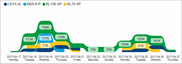
This ribbon chart shows you the gross volume for each device per day. You can see which days were productive and how the gross volume is distributed between your devices.
Facts & Dimensions:
•Y-axis [units]: Gross Volume
•Colors by: Device
•X-axis [date]: Date and Day Name
Drillthrough:
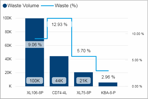
This charts shows you the waste of the last 10 days (absolute volume and percentage) for each device.
Facts & Dimensions:
•Y-axis Dark blue [units]: Waste Volume
•Y-axis (2nd)Light blue line [%]: Waste (%)
•X-axis: Device
Drillthrough:
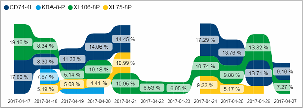
This ribbon chart shows you the waste % for each device per day.
A preferable outcome is that the waste % stays rather constant over the days. If you see some deviations, check the gross production volume in the visual above. Does it explain the unusual value? (A high gross production would keep the waste % low. No production at all, leads of course to no waste %). If the value is unusual, it is time to further investigate the cause.
Facts & Dimensions:
•Y-axis [%]: Waste (%)
•Colors by: Device
•X-axis [date]: Date
Drillthrough:
HD Privacy Statement | Imprint | Prinect Know How