The general context menu appears when you right click on an empty space of the canvas of a layout or 1up drawing.
The following menu opens:
|
Cancel Mode |
With this command, you can cancel the current mode (for example, line drawing). Alternatively, you can also use the "Esc" key. |
|
|
Delete |
Deletes the currently highlighted or selected object. |
|
|
Clear Unstructured Layer |
This option displays in layout drawings only if an unstructured layout drawing was selected. The command removes the objects of an unstructured layout shown in the background. |
|
|
Select |
Opens the following submenu: |
|
|
"Select" submenu |
||
|
Select all |
You can select all the elements of the current drawing (layout or 1up) with this command. Key shortcut: Ctrl+A |
|
|
Deselect All |
You can deselect all the currently selected elements with this command. |
|
|
Toggle selection |
You can deselect all the currently selected elements and select all the other elements with this command. |
|
|
Select by Attributes |
Opens the Dialog "Select Objects". |
|
|
Deselect by Attributes |
Opens a dialog identical with the Dialog "Select Objects". But the objects determined in this way are removed e from the selection. |
|
|
Objects |
Opens the following submenu: |
|
|
Submenu "Objects" |
||
|
Show |
Shows the highlighted or selected object. |
|
|
Hide |
Hides the highlighted or selected object. |
|
|
Object Properties |
Invokes the "Object Properties" dialog for the highlighted or selected object. |
|
|
Dimension Properties |
This is where you can set the properties of this dimension. See Dialog "Dimension". This item is only operable if you have selected a dimension beforehand. |
|
|
Convert Parts |
(Only in the "Layout" tab for selected objects) This command lets you convert a layout part to its constructional objects. |
|
|
Show Dimensions |
You can show or hide dimensions with this command. |
|
|
Align Dimensions |
You can align all dimensions automatically with this command. |
|
|
Opens a submenu where you can select/deselect the objects which are to be visible. It contains the following items: |
||
|
Submenu "Show" |
||
|
Hidden Objects |
You can show all hidden parts (e.g. dimensions) with this command. |
|
|
Constraints |
|
|
|
Control Points |
Points at the ends of each line and in the centers of arcs |
|
|
Axes |
Coordinate system axes |
|
|
Centers |
Centers of arcs and circles |
|
|
View Composites |
|
|
|
Symbols can be associated to line styles. See Symbol. |
||
|
Images |
You specify the PDF files loaded to the project as images in the "Content" step of Prinect Signa Station. Here, you can show and hide them. The button "Show Images" has the same function. |
|
|
Select viewed image |
You can select the image displayed here if you populated the same 1up in the "Content" step of Prinect Signa Station with various images. The button "Change Article" has the same function. |
|
|
Clipped images |
These parts will be clipped if the image is larger than the 1up. With this function, you can toggle the view between clipped and complete image. The button "Clipped images" has the same function. |
|
|
Layer Modified Images |
|
|
|
Images in Background |
|
|
|
Here you can switch the marker on and off that indicates if the front or rear side is currently on display. |
||
|
Opens a submenu where you can select the current view of the graphical preview. It contains the following items: |
||
|
Submenu "View" |
||
|
Previous Zoom |
Returns to the previous zoom level. Key shortcut: Alt+F5 |
|
|
Zoom In |
Zooms in the current view. Key shortcut: Alt+F2 |
|
|
Zoom Out |
Zooms out the current view. Key shortcut: Alt+F3 |
|
|
Zoom In Here |
Zooms in the area around the current mouse pointer position. The button "Zoom In" has the same function. Key shortcut: F2 |
|
|
Zoom Out Here |
Zooms out the area around the current mouse pointer position. Key shortcut: F3 |
|
|
Fit |
Fits the graphic into the current size of the window. The button "Zoom to Fit Drawing" has the same function. Key shortcut: F4 |
|
|
Navigator |
Displays the Navigator dialog. A small preview of the entire canvas is shown. A gray frame identifies the current view. You can pan this frame in the Navigator and set the zoom level with the slider. |
|
|
View Front side |
This is where you can toggle the view between front and rear side. |
|
|
Options |
Opens a submenu where you can make settings for various objects. It contains the following items: |
|
|
Submenu "Options" |
||
|
Global Styles |
Opens the Dialog "Global Styles" where you can edit line styles. |
|
|
Show Dimensions |
Opens the Dialog "Dimension" where you can edit the dimension line appearance. |
|
|
Colors |
Opens the Dialog "Color". |
|
|
Enable rear-side image clipping |
The image will be clipped if it is larger than the 1up. With this function, you can toggle the view between clipped and complete image. The button "Clipped images" has the same function. |
|
|
|
CAM |
This is where you can set the properties of cutting plotter export files. See CAM properties. |
To open the "Select Objects" dialog, right click on an empty space and choose "Select" > "Select by Attributes".
Specify the properties you want. Clicking "OK" selects all parts with these properties.
To select, for example, all lines between 2 and 4 cm long, choose "Line" as "Type" and specify the values for "Length".
|
Type |
Choose the object type here, e.g. arc, line or text. |
|
Style |
Choose the object style here, e.g. cutting, creasing or bleed. |
|
Color |
Choose the object color here. |
|
Pattern |
Choose the line pattern here. |
|
Length |
Enter a length range in centimeters here. |
|
Depth range |
Specify a value for the depth range here. |
|
Line width (pt) |
Specify a value for the line width here. |
|
Tangent angle |
Type a value for the angle between the tangent and the X-axis in the first box. A straight line is identical with its tangent. Type the angle allowance in the second box. To select, for example, all horizontal lines, type the values "0° +/- 0°". |
Back to General Context Menu.
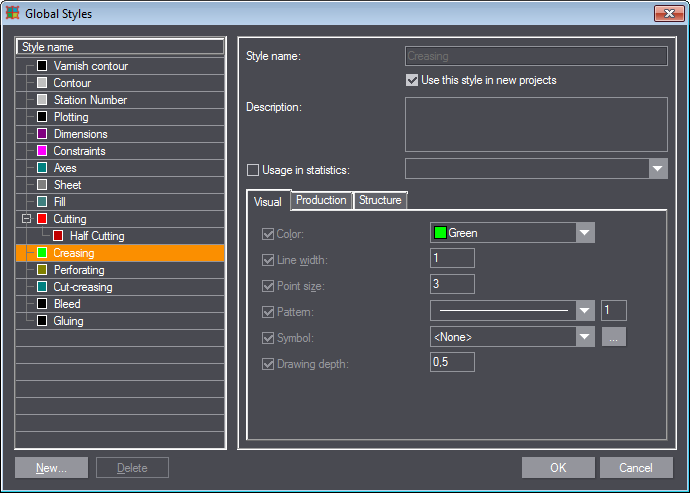
A style is a set of predefined properties with assigned values (like color, line width, point size, pattern and some OpenGL graphical settings), which are applied to the different objects (e.g. geometric objects, dimensions, etc.). You can create new styles and edit the existing system styles. There are various system styles from which you can select.
A global style is a style that applies to all projects you work with. All system styles are global and can serve as 'parents' of user-created global styles.
You can find an example for a new style in: Wavy box panel.
1.Right click on an empty space in the 1up or Layout tab.
2.In the context menu, choose "Options > Global Styles ...".
The following dialog displays where you can view and edit the properties of styles or create new styles.
|
Controls in the Dialog "Global Styles" |
||
|---|---|---|
|
Style name |
Displays a list of all system and user-created styles available. Select the style to edit with the mouse or the UP/Down arrow keys. In the tabs on the right, the program dynamically displays the respective properties. |
|
|
New... |
Invokes the "New Style" dialog where you can create a new object style. |
|
|
"New Style" dialog |
||
|
Style name: |
Define the name of the new style here. |
|
|
Parent style |
Choose the parent style of the new style here. The style inherits all properties of the parent style. This is useful when you need a style that is similar to another style - instead of entering all the properties "from scratch" you can simply set a parent style and then modify the differing properties. The new style appears below its parent style in the style list. If you want the new style to have no parent, select <None> from the "Parent style" list box. |
|
|
Type |
Specify the style type here if you did not choose a parent style. You can choose from: "Flat", "Perforating", "Cutting and Creasing", and "Composite". |
|
|
Delete |
Deletes the style selected in the Styles list without prompting for confirmation. Note: You cannot delete system styles. |
|
|
Style name |
Defines the name of the style. It is read-only for system styles and editable for user-created styles. |
|
|
Description |
You can type annotations to the current style in this box. |
|
|
Usage in statistics |
|
|
|
Color |
Here you can choose the object color. All objects in the style will appear with the specified color. |
|
|
Line width |
You can choose the line width of the object style here. The values range between 0.1 and 10 (system) units. This value applies ONLY to the screen representation of this style. This value has no effect on the line width during printing. |
|
|
Point size |
This is where you define the size of the points in the selected style. Allowed value range: [0.10, 15.00]. |
|
|
Defines the line pattern of the selected style. The edit box to the right of the Pattern list box specifies the proportional scaling of the length of the pattern segments and the blank intervals between them. Greater values result in longer segments and intervals. Allowed value range: [1, 10]. The Pattern list box offers a set of predefined standard patterns plus an option for a custom pattern. Either choose a predefined pattern or click the (Custom...) item at the end of the list to invoke the Dialog "Edit pattern". |
||
|
You can select a symbol for the line style here. Click the button with the three dots and choose an image file. Each line will then be identified in the drawing with this image symbol as soon as you enable the sub item Show Style Symbols below the "Show" item of the context menu. |
||
|
Defines the depth (priority of visual screen display) of the object with the selected style. When you have two or more entirely or partially overlapping objects in the canvas, the system gives priority to the object with the greatest depth value when displaying it on the screen. In other words, greater depth values give the object a higher priority for visual representation on the screen, and vice versa. Allowed value range: [-1.00, 1.00].
Note: The default depth values for the styles used for drawing objects (e.g. cutting, creasing, etc.) are greater than the ones for other types of styles (e.g. dimensions, axes).
Note: If the overlapping objects are of the same styles or of different styles but with the same depth values, the system gives higher priority to the new objects drawn, i.e. the newer the object - the higher priority it has. |
||
|
Tab "Production" |
||
|
This edit box defines the real line width, measured in points (1/72 inch). Changes in this edit box do not result visually on the screen, but its value defines the line width of all objects of the selected style in printing and for toolpath generation in CAM sample-making. The value in this edit box is very important for CAM samplemaking because if the width of the respective CAM tool is smaller than the line width specified here, the system may generate a different toolpath, involving, for instance, offsetting of wide lines for the cutting tool (for changes of the line width settings of a style associated with the cutting tool). |
||
|
This is where you can set up the production process, for example "Glue/adhesive tape wheel", "Creasing wheel" or "Slotting". |
||
|
Bevel cut angle |
You can define the bevel angle here if you chose "Bevel cutting knife", "Bevel half-cutting knife" or "V-cut channel" in the production process. |
|
|
Tool type |
Displays the function of the tool. |
|
|
Tab "Structure" |
||
|
Overriden |
You can set the structure of the style regardless of the higher level style if this option is enabled. |
|
|
Cut Style |
(Relevant to the "CutCrease" and "Perforating" styles only) Defines the style of the cutting segments of all objects of the "CutCrease" and/or "Perforating" styles. The default style is "Cutting". However, you are allowed to assign another style and then associate it with the desired tool in the CAM template. |
|
|
Crease style |
(Relevant to the "CutCrease" style only) Defines the crease style and, in the small input box, the line width. Allowed value range: [0.01 inch, 10000.00 inch] |
|
|
Blank length |
(Relevant to the "Perforating" style only) Defines the length of the blank segments which will be left intact (i.e. the line parts that will not be cut). Allowed value range: [0.01 inch, 10000.00 inch] |
|
|
Minimum end |
(Relevant to the "CutCrease" and "Perforating" styles only) Defines the length of the segments which will be of the style specified in the "Cut style" edit box. Normally these are the segments that will be cut, unless another style is specified in the Cut style edit box. Allowed value range: [0.01 inch, 10000.00 inch]. |
|
|
Allow longer ends |
Allows adding a longer end to the end of a line. |
|
|
Start with cut |
Always begins a line with a cut segment. |
|
Back to General Context Menu.
Click "Options > Global Styles" in the general context menu. Enable the "Pattern" option in the "Visual" tab and select "(Custom...)" in the list box. The following dialog displays:
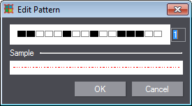
To create a custom pattern, click the black or white pattern boxes you want. A black box produces a segment, and a white one - an interval between the segments. The system automatically shows a sample of the pattern in the "Sample" region of the dialog, using the assigned color and line width of the style.
The edit box to the right of the boxes specifies the proportional scaling of the length of the pattern segments and the blank intervals between them. Greater values result in longer segments and intervals. Allowed value range: [1, 10].
Back to Dialog "Global Styles".
Back to General Context Menu.
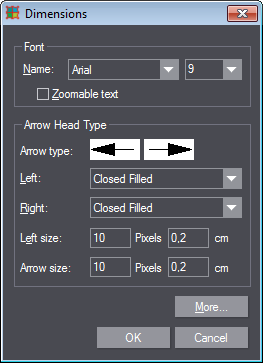
Right click on an empty space in the 1up or Layout tab. In the context menu, choose "Options > Dimension".
The following dialog contains general options for setting how dimensions are displayed, like the font of the dimensions' values, the arrow head types, etc.
|
Controls in the Dialog "Dimensions" |
||
|---|---|---|
|
Font |
||
|
Name |
Defines the font which the system will use to display the text of the dimension values in the graphical pane. |
|
|
Size |
Defines the font size |
|
|
Zoomable |
When this option is checked, the system will zoom in/out the dimension text together with the 1up in the canvas. When this option is not checked, the text will always be displayed in the font size assigned to the dimension, irrespective of whether you are zooming the view or not. |
|
|
Arrow head type |
||
|
Displays a preview of the arrows as they will appear in the graphical pane. You can change these by clicking on one of the sample images. When you click the first sample image, both sample images change at the same time. When clicking on the second sample image, only this image is changing. Thus, you have options to choose either same or different arrow types for the both ends of a dimension line. |
||
|
Left/Right |
Defines the type of the left/right arrow head of the dimension line. The list contains a number of predefined arrow types. When you select an arrow type, the system immediately displays its sample in the Sample fields above. |
|
|
Left size/Right size
|
Specify the size of the left/right arrow head in pixels and in cm: |
|
|
Pixels |
Defines the size of the left arrow head, measured in pixels. This value applies ONLY to the way the selected dimension line(s) will be displayed on the screen in the 1up, Layout and/or Print drawings. It does not affect the "real" arrow head size of the dimension line(s) in printing. |
|
|
cm |
Defines the "real" size of the arrow head, measured in the current metric units. Changes in this edit box are not reflected visually on the screen, but its value defines the arrow head size of the selected dimension line(s) in printing. |
|
|
More ... |
Invokes the Dialog "More Dimensions Options" for editing additional text position and size options. |
|
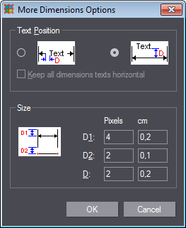
Dialog "More Dimensions Options"
To open the dialog "More Dimensions Options", choose "Options" > "Dimension" in the general context menu and click the button "More".
|
Controls in the dialog "More Dimensions Options" |
||
|---|---|---|
|
Text Position |
Choose one of two possible positions of the dimension text. Checking the first radio button will place the text in-between the dimension line, and checking the second button will place the text "above" the line. |
|
|
Size |
||
|
D1 |
This is where you specify the distance between the dimension line and the ends of the dimension border lines. |
|
|
Pixels |
Offset in pixels: This value applies ONLY to the way the selected dimension line(s) will be displayed on the screen in the 1up, Layout and/or Print drawings. It does not affect the "real" display of the selected dimension line. |
|
|
cm |
"Real" offset in cm: Changes in this edit box are not reflected visually on the screen, but its value defines the span between the dimension line and the ends of the dimension border line in printing. |
|
|
D2 |
Here, you define the span of the blank intervals between the object(s) being dimensioned, and the beginnings of the dimension border lines. For "Pixels" and "cm", see above. |
|
|
D |
Defines the span of the blank interval(s) between the dimension line and the text. |
|
|
Pixels |
Offset in pixels: This value applies ONLY to the way the selected dimension line(s) will be displayed on the screen in the 1up, Layout and/or Print drawings. It does not affect the "real" display of the selected dimension line. If you have set the first text position option (the first radio button above, respectively), these are the two blank intervals between the text and the dimension line ends to the right- and left-hand sides of the text. In the other case - the second option - the blank interval is between the dimension line and the text "above" it. |
|
|
cm |
"Real" offset in cm: Changes in this edit box are not reflected visually on the screen, but its value defines the span between the dimension line and the ends of the dimension border line in printing. If you have set the first text position option (the first radio button above, respectively), these are the two blank intervals between the text and the dimension line ends to the right- and left-hand sides of the text. In the other case - the second option - the blank interval is between the dimension line and the text "above" it. |
|
Back to General Context Menu.
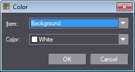
You can edit the colors of the user interface here. These are: the colors of the background of the graphical pane, the colors of an object when you drag, select, highlight or activate it, and also the colors of the coordinate axes when the printed or the non-printed side of the active drawing is viewed, respectively.
To open the "Color" dialog, right click an empty space on the canvas and choose "Options > Colors..." in the context menu.
|
Controls in the Dialog "Color" |
||
|---|---|---|
|
Part |
Defines the area (item) whose color will be edited. |
|
|
Background |
Background denotes the background of the graphical pane. The default color is White. |
|
|
Dragging |
Drag denotes the coloring of the sample image of the objects while you are dragging them in the graphical pane. The default color is Blue. |
|
|
Selection |
Selection denotes the coloring of the objects when they are selected. The default color is Magenta. |
|
|
Highlight |
Highlight denotes the coloring of the objects when you hover with the mouse over them in the graphical pane. The default color is Cyan. |
|
|
Activated |
"Activated" denotes the color of the first object that you select when you are aligning a 1up in the Mode "Align parts". The default color is Yellow. |
|
|
Highlight selection |
|
|
|
Semi selection |
|
|
|
Printed side axes |
"Printed Side Axes" denotes the color of the coordinate axes in the current drawing when the printed side of the current drawing is viewed. The default color is DarkCyan. |
|
|
Rear side axes |
"Rear Side Axes" denotes the color of the coordinate axes in the current drawing when the rear side of the current drawing is viewed. The default color is Blue. |
|
|
Unstructured layer object |
|
|
|
Color |
Defines the color of the above selected item. Provides a list of the basic colors and a standard option for assigning a custom color (Custom...). |
|
Back to General Context Menu.
Back to Context Menus.