•Net Productivity (1/h) and Net Output (1/h)
•Gross Volume, Waste Volume and Waste (%)
•Gross Volume, Waste Volume and Waste (%)
•Waste (%) by Date and Employee
•Operating Time (h) and Operation Count by Date and Time type
•Net Output (1/h) by Date and Employee
•Operating Time (h) by Date and Time type
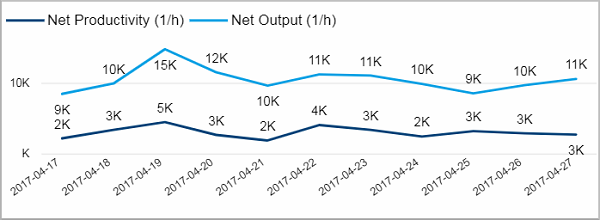
Net Productivity (1/h) and Net Output (1/h)
This visual shows the net productivity and the net output for the selected device over the course of the last 10 days.
The net productivity is defined as the net volume divided through the whole operating time (from switch on to switch off). It tells you how many good products were produced per operating hour.
Net Output is defined as the net volume divided through the operation related time. This is the time period between first good sheet and last printed sheet. In contrast to the net productivity, that takes the complete operation time from switch on to switch off into account, the net output tells you how many good products were produced per printing hour.
Obviously the value for net output will always be bigger than for the net productivity. The bigger the difference between these two values the more time has passed that was not used for production.
If you want to look closer into the net productivity and net output, go to the page Speed by devices.
Facts & Dimensions:
•Y-axis Dark blue line [1/h]: Net Productivity (1/h)
•Y-axis Light blue line [1/h: Net Output (1/h)
•X-axis [date]: Date
Drillthrough:
Gross Volume, Waste Volume and Waste (%)
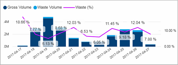
This visual combines two different Y-axises into one chart.
Facts & Dimensions:
•Y-axis Dark blue [units]: Gross Volume
•Y-axis Light blue [units]: Waste Volume
•Y-axis (2nd) Purple line [%]: Waste (%)
•X-axis: Date
Drillthrough:
Waste (%) by Date and Employee
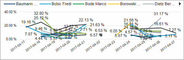
This chart shows you the waste percentage for each employee during the course of the last 10 days.
Facts & Dimensions:
•Y-axis [%]: Waste (%)
•Colors by: Employee
•X-axis: Date
Drillthrough:
Operating Time (h) and Operation Count by Date and Time type
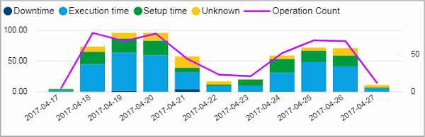
This chart has two Y-axises. On the one side it shows you the operation time split into the different time types for each day (for all selected devices). On the other side it displays the number of operations.
You can find further details about the operation time on the page Utilization by Devices .
Facts & Dimensions:
•Y-axis [h]: Operating Time (h)
•Colors by: Time type
•Y-axis (2nd): Operation Count
•X-axis: Date
Drillthrough:
Net Output (1/h) by Date and Employee
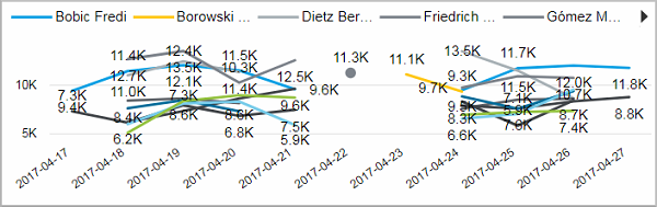
This chart shows you the net output (number of good products per operation hour) for each employee during the course of the last 10 days.
Facts & Dimensions:
•Y-axis [1/h]: Net Output (1/h)
•Colors by: Employee
•X-axis [date]: Date
Drillthrough:
Operating Time (h) by Date and Time type
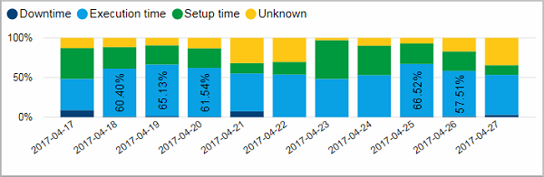
Like the chart above this visual shows you the operation time split into the different time types for each day (for all selected devices). But instead of absolute hours it shows you the percentage for each time type.
You can find further details about the operation time on the page Utilization by Devices .
Facts & Dimensions:
•Y-axis [h]: Operating Time (h)
•Colors by: Time type
•X-axis [date]: Date
Drillthrough:
HD Privacy Statement | Imprint | Prinect Know How