•Net Output (1/h) of Net Productivity (1/h)
•Effective Processing Time (h) of Production Time (h)
•Operating Time (h) and Gross Volume
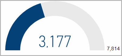
Net Output (1/h) of Net Productivity (1/h)
This gauge chart shows you the value for the net output per hour on a scale with a maximum value that is the net productivity per hour.
The net productivity is defined as the net volume divided through the whole operating time (from switch on to switch off). It tells you how many good products were produced per operating hour.
Net output is defined as the net volume divided through the operation related time (this is the time period between first good sheet and last printed sheet). In contrast to the net productivity that takes the complete operation time from switch on to switch off into account, the net output tells you how many good products were produced per printing hour.
Obviously the value for net output will always be bigger than for the net productivity. The bigger the difference between these two values the more time has passed that was not used for production.
If you want to look closer into the net productivity and net output, go to the page Speed by devices.
Facts & Dimensions:
•Gauge value [1/h]: Net Output (1/h)
•Maximum value [1/h]: Net Productivity (1/h)
Effective Processing Time (h) of Production Time (h)
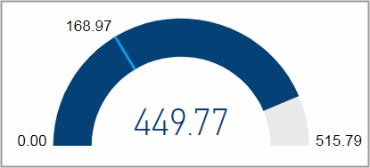
Effective processing time: hours from start to finish of an operation including stops.
Production time: hours spend producing excluding stops.
Operating time: complete time span from device switched on to device switched off.
This gauge chart displays the effective processing time on a scale with a maximum value that is the operating time. The production time is marked with a light blue line.
If you want to look closer into the time utilization, go to the page Utilization by Devices .
Facts & Dimensions:
•Gauge value [h]: Effective Processing Time (h)
•Maximum value [h]: Operating Time (h)
•Target value [h]: Production Time (h)
Operating Time (h) and Gross Volume
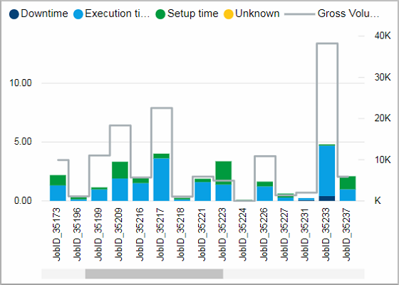
This chart shows the operating time and its distribution into time types as well as the gross volume for single jobs.
It might be easier to look at this chart in full screen by using the focus mode.
Facts & Dimensions:
•Y-axis stacked columns [h]: Operating Time (h)
•Colors by: Time type
•Y-axis (2nd)Grey line [units]: Gross Volume
•X-axis: Job Number
Drillthrough:
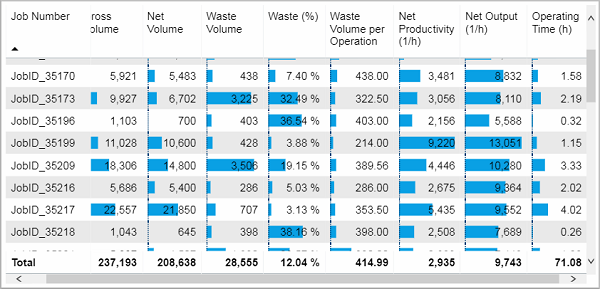
This table lists the shown data for each job.
Facts & Dimensions:
Drillthrough:
HD Privacy Statement | Imprint | Prinect Know How